
Kidbo
Making Parenting Simple. Kidbo delivers relevant content to parents on the go.
Problem
Parents want the best for their kids and often feel overwhelmed with the countless micro and macro decisions that come along with being a parent. Parents spend hundreds of hours going down the Internet rabbit hole of information. Kidbo saves empowers parents & saves them precious time by curating the latest knowledge relevant to each individual parent.
My role: Product Designer (Contract)
This was one of my first projects as a freelance UX Designer. The primary goal was to design an intuitive onboarding experience that allowed parents to understand the app and input relevant details about their kid(s) for a personalized experience.
The Kidbo came to me with some initial wireframes & brainstorming for the app concept. The primary goals were to develop an intuitive onboarding experience for parents & an engaging, curated LinkedIn-like feed for sharing, learning from, and connecting with other parents.
Initial wireframes/mind mapping
Onboarding flow

Mobile website prompted users to download the app for the full experience.

Provided (and prioritized) social login options for ease of creating an account/logging in. Social login would also create the opportunity for a more personalized experience and save the user time answering certain demographic questions.

I intentionally chose photography to evoke joy and show babies/toddlers for a parent/kid-centric app.

I kept the input label visible to remind user of the action they are taking / maintain context.

After signing up, the parent was prompted to add details about their child(ren).

Option to add multiple children during onboarding for a personalized experience. Adding birthday would allow the app to know the child's age at any given time and provide the user with relevant content based on the age of/number of children.
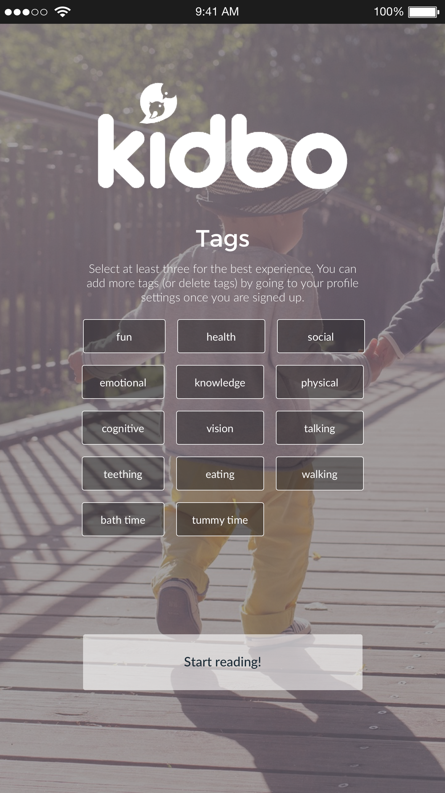
Parents could select tags to create a more curated discovery experience in the app based on topics they cared about.

User had to select at least 3 tags to move forward with the experience. This allowed the algorithm to have more accuracy in customizing the experience.
Feed & Profile

The feed provided a curated view of the user's latest articles and stories to read. If the user didn't have time to read the article or wanted an easy way to reference it later, they could bookmark and save it to their profile.

Visually, we wanted to prioritize the articles' imagery to humanize the experience and capture the reader's attention. I created a few generic backgrounds with the Kidbo logo when an article didn't have a header image for visual consistency.
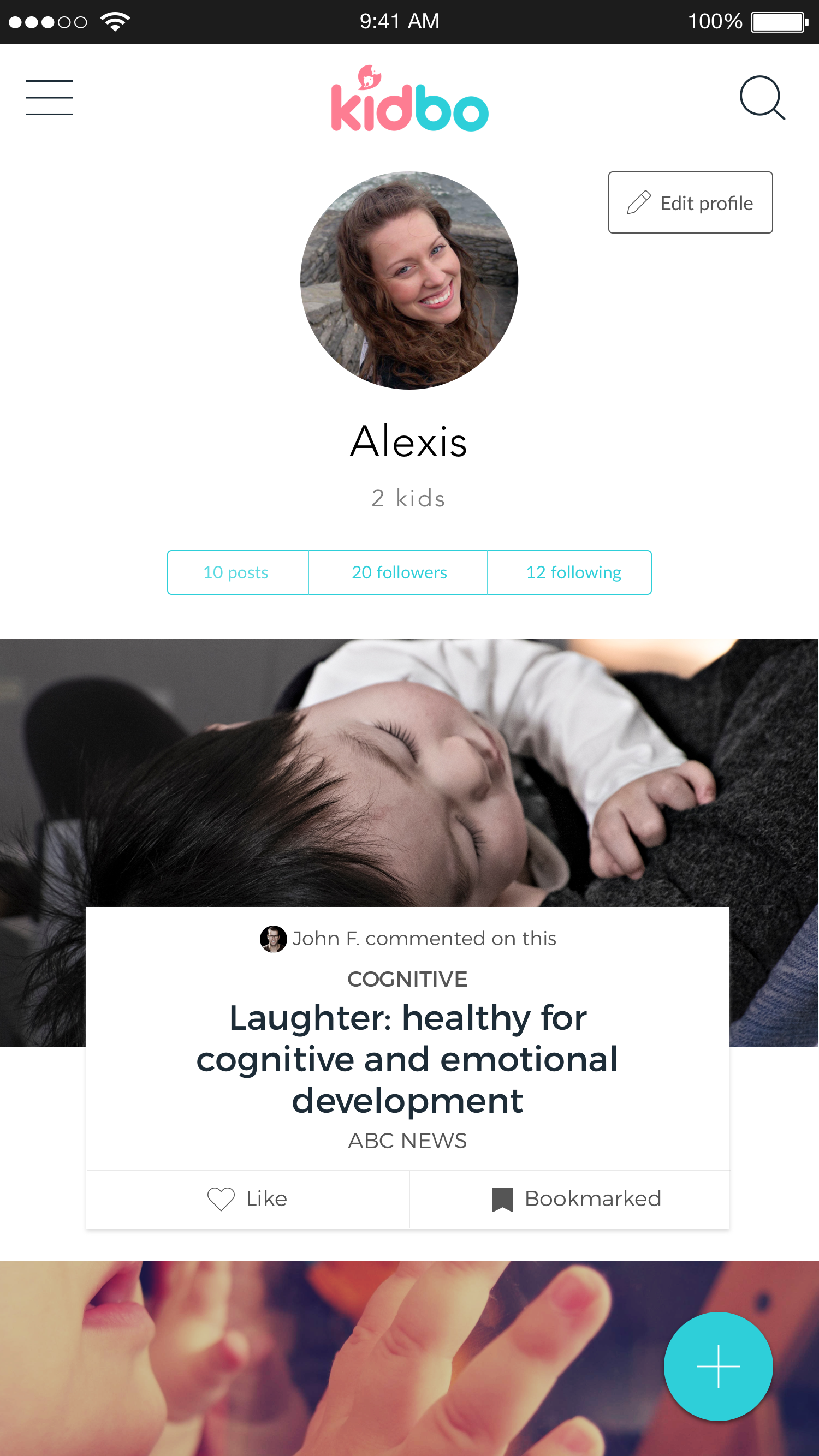
The user's profile allowed them to edit their settings and see their bookmarked articles for easy reference. It would also show if someone in their network had commented on an article for relevancy.
Sharing

I played around with a few different visualizations for additional actions (beneath tags vs. above the article title).

In this UI, the actions were displayed more prominently (& colorfully) above the article title.
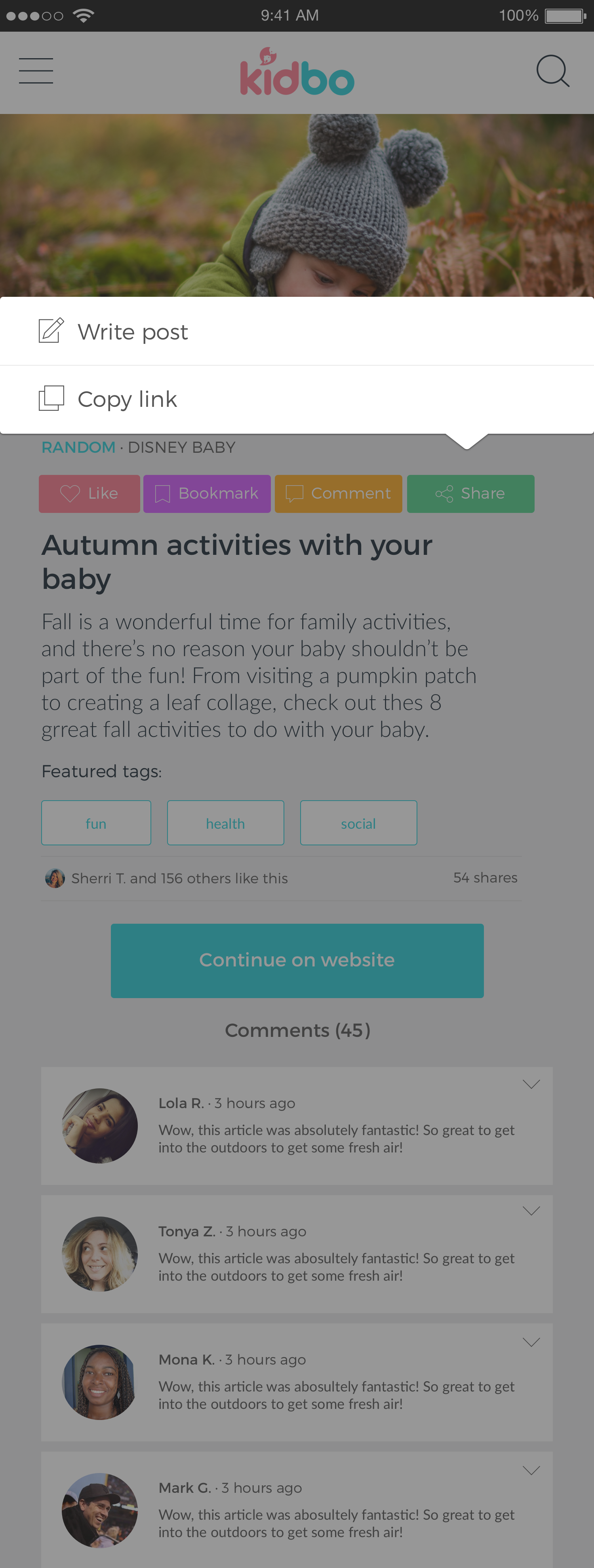
Clicking "share" gave the user two options for sharing: create a new post to share with the feed or copy the link. A later version would include options to auto-share in your favorite messaging apps.
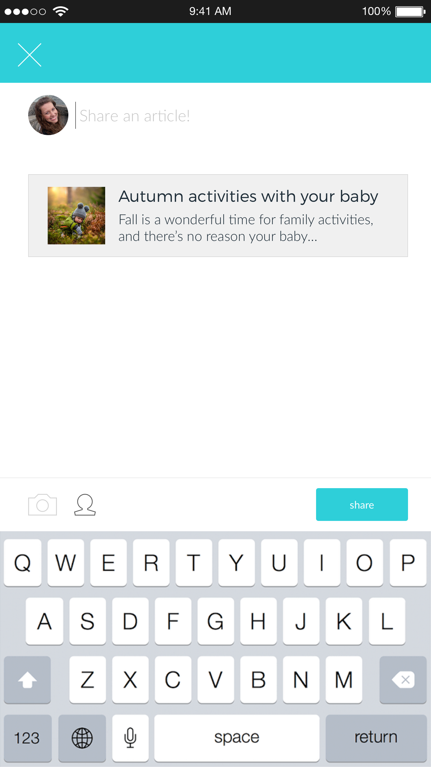
The user could add context to the post and share to their feed or choose to select specific individuals in their community.

Selecting the person icon prompted the user to add specific friends to share the article.
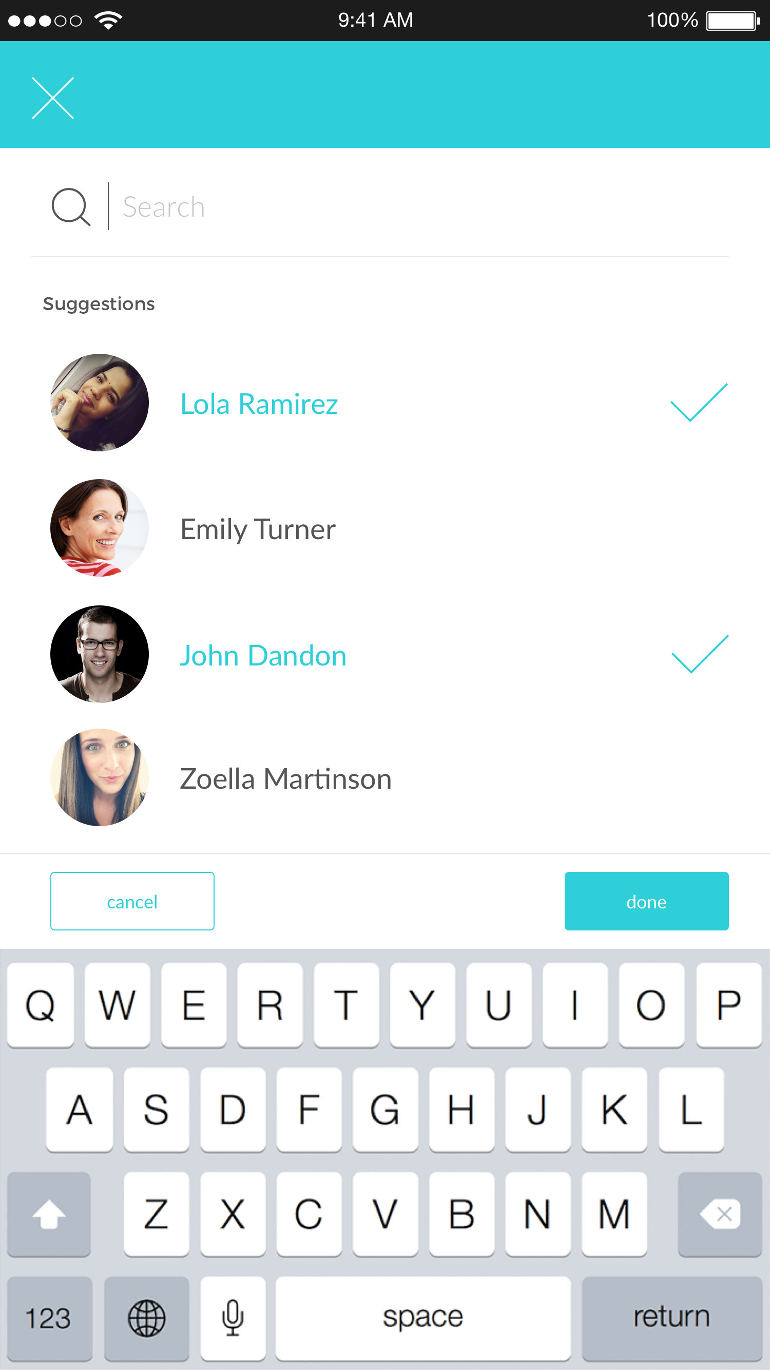
The user could select multiple people to share the article with.

The count at the bottom showed the user that they had selected 2 people to share the article with. They could click the person icon to add additional people.
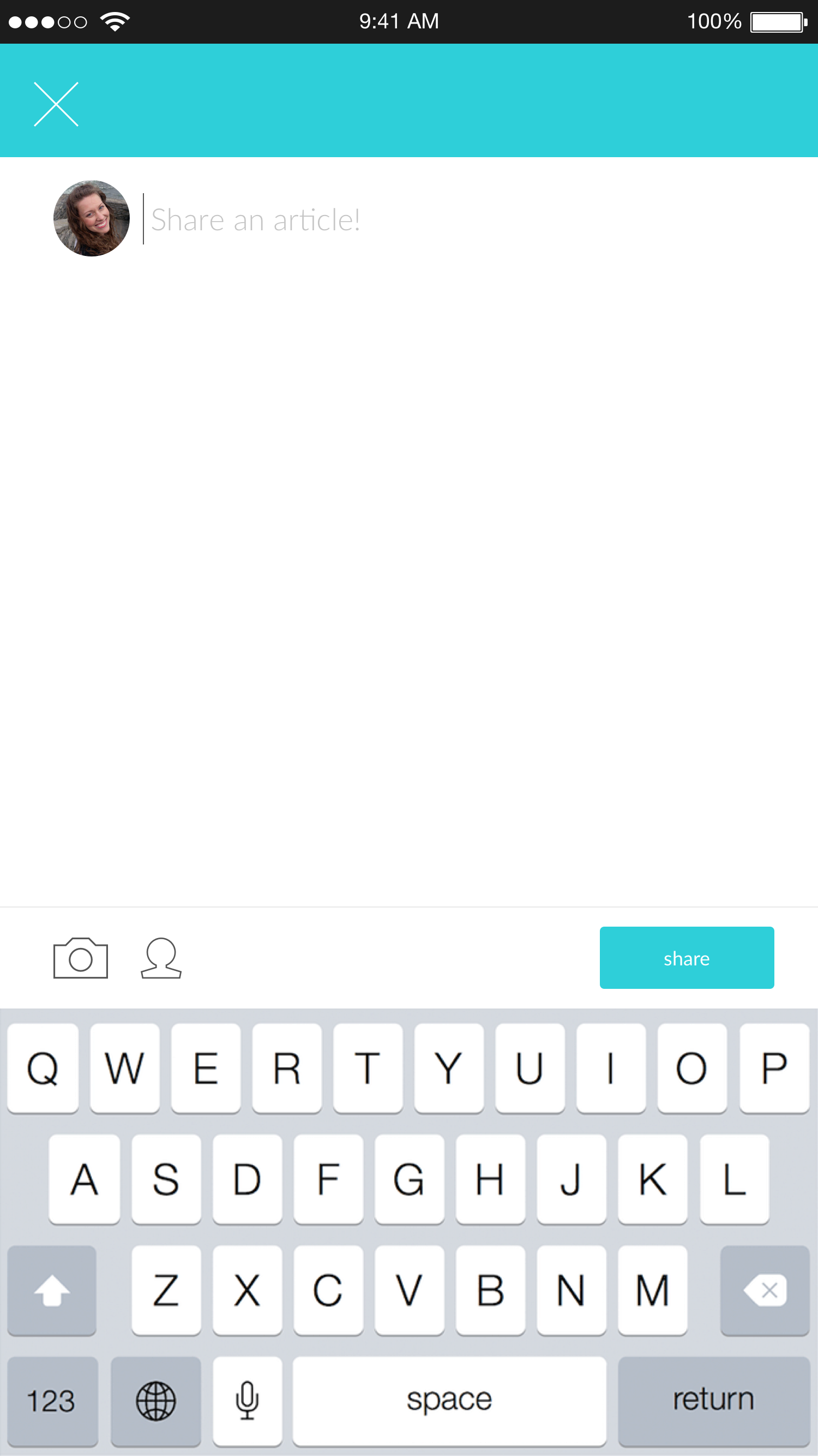
This is the empty state for sharing a post without an article pre-attached.


