
Problem
Employees need a way to better support & engage their employees. Coaches need a way to find the right clients. Individuals need a way to discover the right support at the right time.
Context
I knew the founder of this app from my time at BlackRock. She approached me to design an interactive prototype to get her first customers and a demo for investors.
Tailor the user journey
How might we create an onboarding assessment designed to understand the user's pain points and curate a relevant in-app experience? I started with an outline of the onboarding questions and mapped out a user journey to inform the flow.

Welcome and orient the user with friendly, human, approachable imagery.
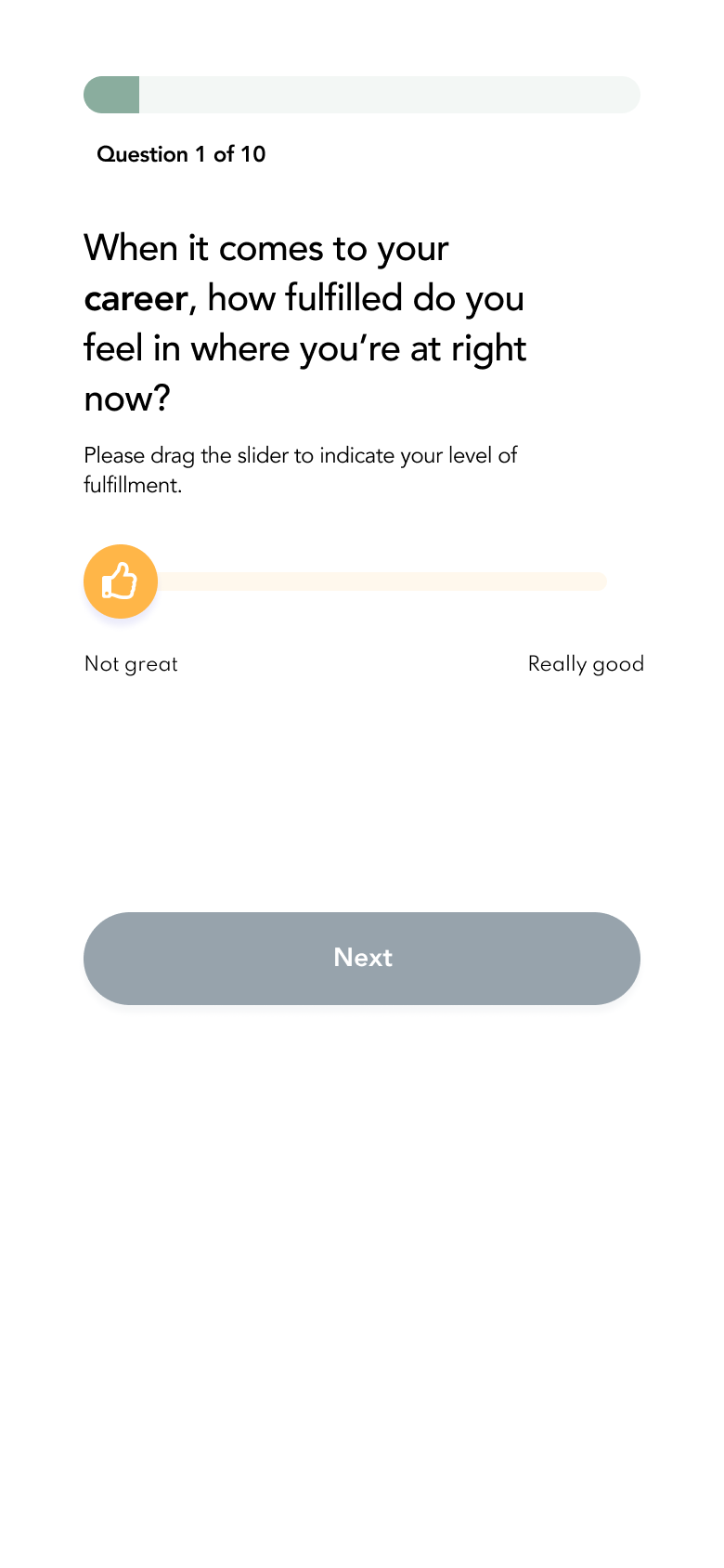
I wrote the questions to feel conversational, like you're talking directly to a person. I designed the inputs to be friendly and fun interaction touchpoints.

Interacting with a prompt enables the "next" step so the user can't skip questions. The progress bar was designed to let the user know where they're at to combat any potential response fatigue or onboarding abandonment.

I designed pre-set options for the final question to seed the user with ideas for daily life improvement. This was to allow them flexibility and reduce the "freeze" factor that can come from having to come up with a response, especially to an unanticipated question. The options would also give the algorithm insight into what areas of the user's life are important to them to personalize the overall experience and provide relevant prompts.
Streamlined chat & booking flow
Once the user completes their assessment, they are directed to a process by which they can assemble a curated team. These are ML-generated recommendations that reflect the user goals, progress, and tailored recommendations. It was important to make the user feel like they had options, but didn’t feel overwhelmed by too many options. One challenge here was giving the user enough context to make a decision, while not giving them too many details to get stuck/distracted.
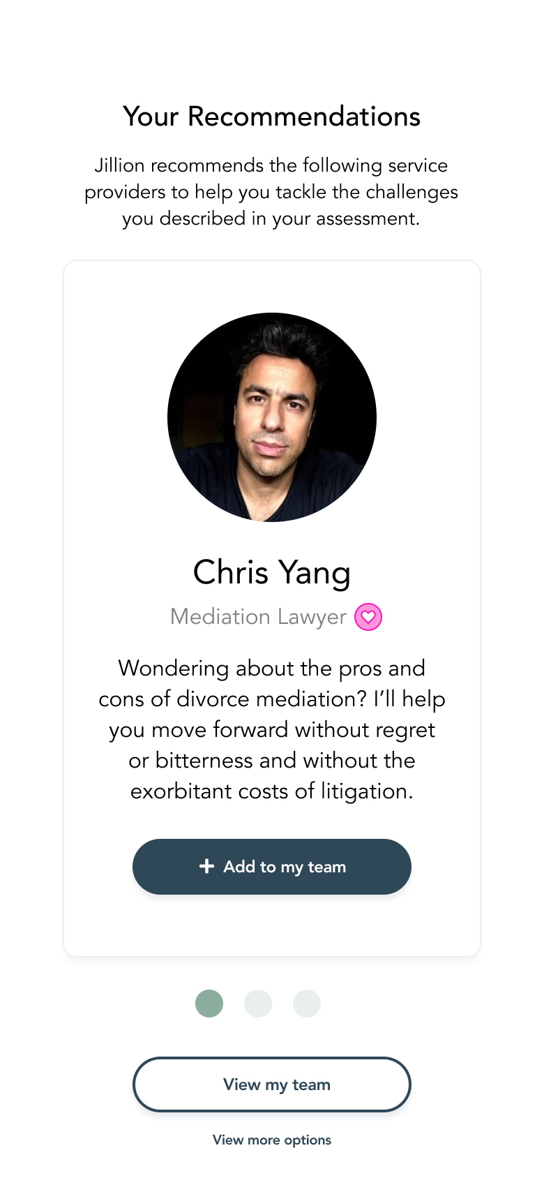
The user gets 3 initial options to quickly scan through. I chose 3 to reduce overwhelm, but still provide flexibility. The user can also view more options if they are unsatisfied with their results.

I added consistent iconography throughout the app for mental association with a particular topic/area of expertise. This snapshot view allows the user to quickly add or remove someone to/from their team and dive further into their recommendations.
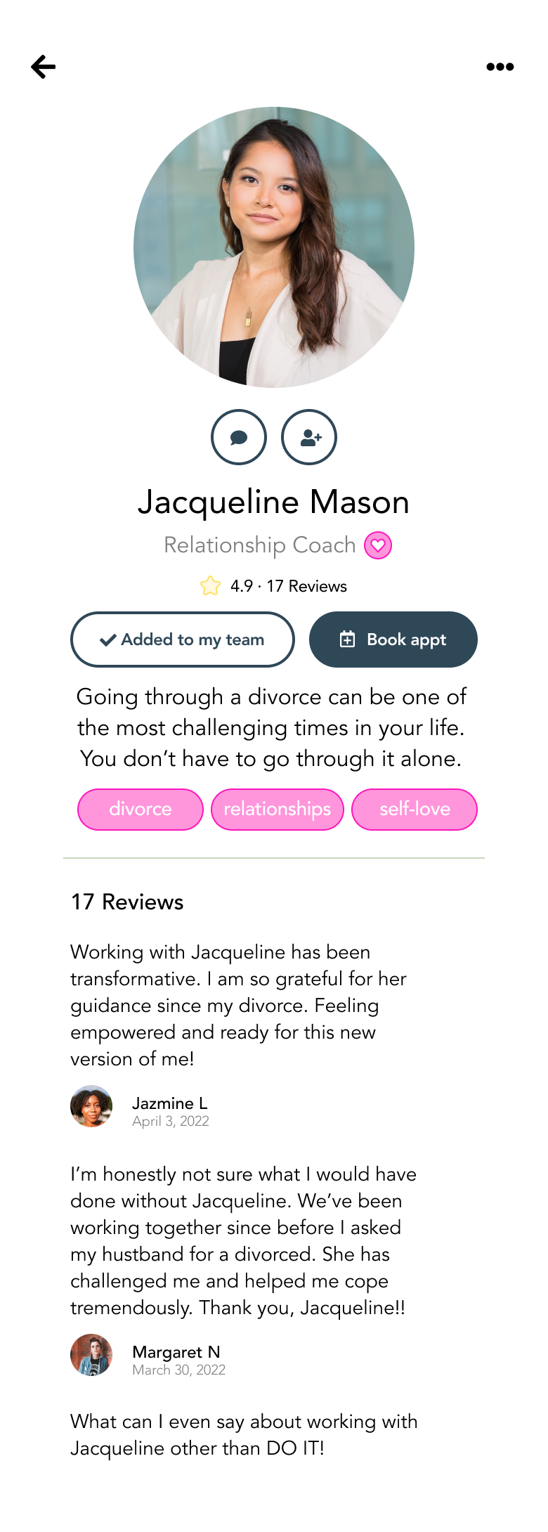
The full profile view gives the user insight into the practitioner's skills, experience, areas of expertise, and reviews to make an informed decision before adding them to or removing them from their team. They can quickly return to their recommendations or continue through to the individual booking flow.
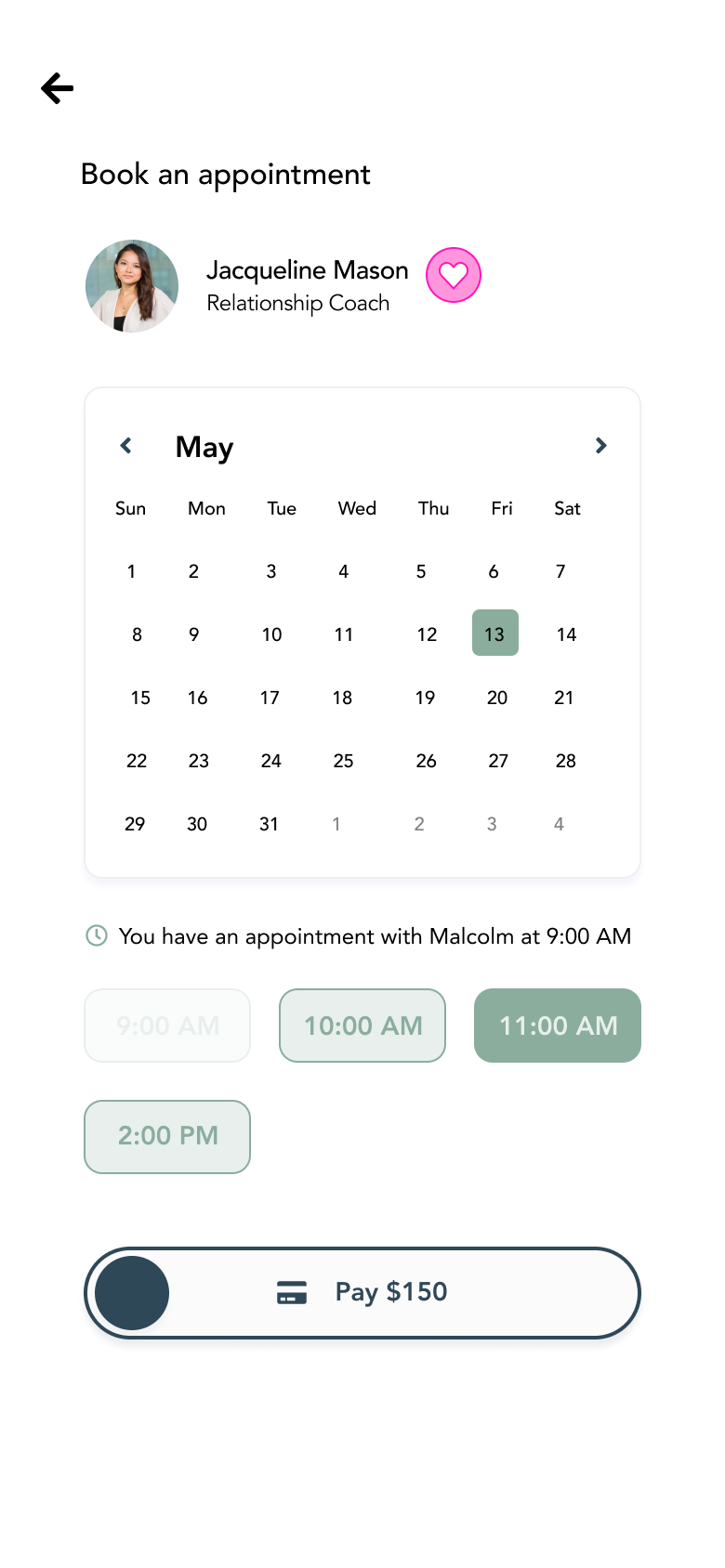
The booking experience provides a quick and easy way to book a session based on the practitioner's availability. All payment is handled through the app to simplify transactions for both client and provider. This also gives the employer insight into bookings and who their "top performers" are/where employees are seeking the most support.
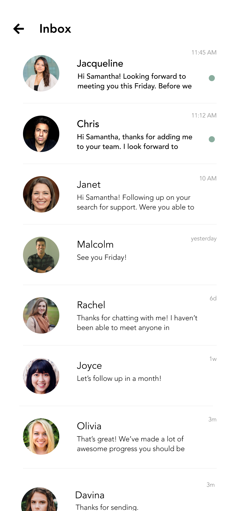
The inbox experience mimics standard messaging patterns to give the user a familiar experience. Practitioners can set up automatic replies once booked/added to a team for a streamlined welcome experience to new clients.
Actionable profile
The profile gave the user insight into their ongoing journey and would change based on their in-app activity and assessment responses. Given that this could be an employer-employee app, we wanted to make the profile a useful tool that gave the user reason to continue checking in and using the app to track their goals.
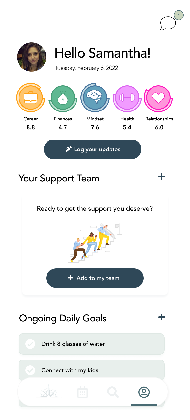
Profile post-assessment. Post assessment, the user's current "state" in each category would be highlighted at the top to show them where they're at and how they're moving toward their goals. They could log updates and/or rely on system contributions (in-app appts, interaction in groups, checking off daily tasks, assessments) to track progress. The "empty" state for the user's team aimed to prompt them to get support (the primary purpose of the app).

This view shows how the user's progress has changed over time. It also gives them a quick snapshot of their "team" and the ability to book an appointment.
White labeling
The goal of the platform was to be extensible based on a given organization’s needs. I designed a white-label mockup of what the Jillion app could look like for a women’s empowerment & professional development community.
⚠️ These are mockups and for demo purposes only.



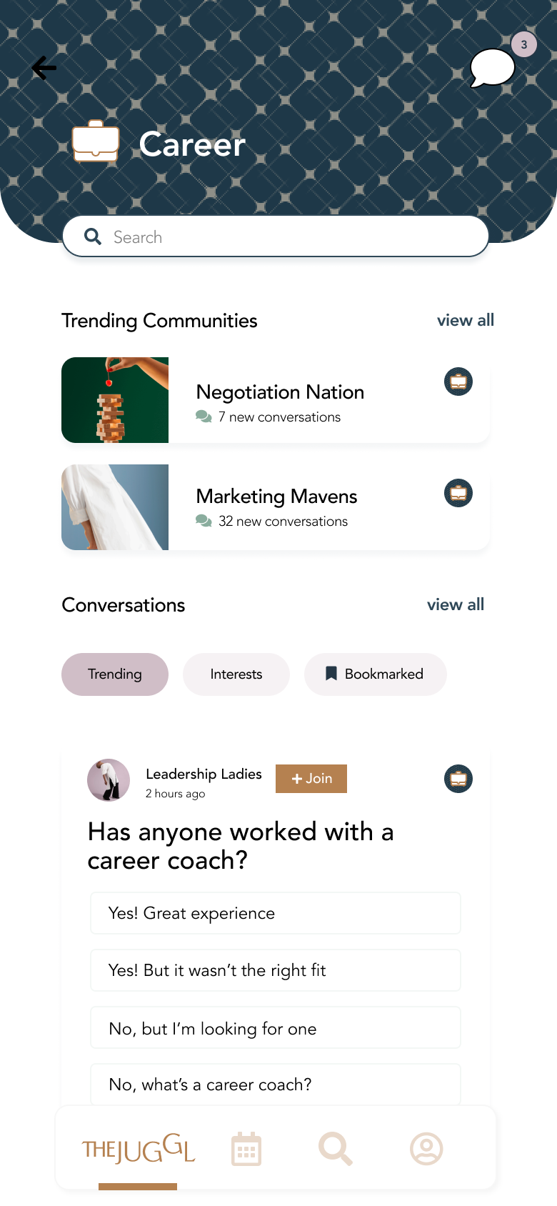
For the white-labeled solution, I maintained a familiar structure and consistent UX that allowed for visual client customization (button styling, branded colors, patterns & imagery).
Customer Portal
On the flip side of the consumer/client experience, we designed an experience for admin users to have a bird’s eye view of the health & engagement of their community or organization.
Key Decisions
Dashboard provided high level overview to Jillion admins to understand health of their employees and product engagement
Navigation alluded to future capabilities of the platform
Community feel to humanize the experience within the organization
"Top" sections in the side panel to provide actionable feedback on what's working (could drill in further to see what's not)
Leaderboard to identify high performers
Prototypes
Outcomes & Takeaways
Built 2 interactive prototypes for client to demo for prospective customers
Based on initial demos, designed white label experience for prospective first customer
Client successfully landed first customer with goal of building a case study for investment opportunities and future customer acquisition
With more time, would expand on the admin experience to give org leaders insight into the challenges people are facing in their organization and opportunities to uplift top-performing/sought after practitioners. We would also need to design an experience for providers and think through their goals (metrics, CTR, earnings, messaging, setting up auto-responses).


