Problem
Building a diverse, equitable and inclusive organization is hard. Finding DEI expertise and services shouldn't be.
Context
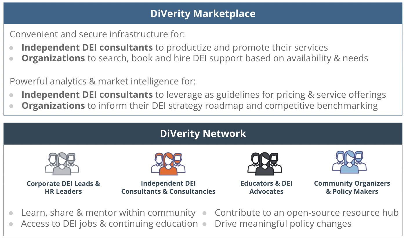
The DiVerity team approached me to design the MVP of their app, which helps organizations find DEI talent and helps DEI talent find job opportunities. I was the lead designer working mostly with the CTO & Lead Engineer. I also worked with the CEO to design a proprietary industry-leading tool for hiring managers to better understand their DEI needs. Challenge: Ship MVP that services both clients & consultants in 90 days.
Goals
Starting point
Onboard DEI consultants and companies → walk new users through an onboarding process that optimizes for profile completion with enough data for the algorithm to make an intelligent match
Design a matching process to connect consultants with the right opportunities // allow companies to discover DEI talent specific to their needs
Make it easy for DEI consultants to add their experience and showcase existing projects on their profiles
Design proprietary tool (interactive “DEI Stack”) to help companies/hiring managers understand their DEI needs
Post MVP
Design logic-based flow to optimize consultant <> project match
Allow consultants to add their payment details (via Stripe Connect)
Digitize request for proposal (RFP) experience
Allow consultants to invite collaborators to their projects & proposals
Give hiring managers an easy way to view their pipeline & advance candidates through the hiring process
My contributions
End-to-end interaction design
UX strategy
Branding
UX writing
Process: getting started on the project
Step 1: Understand the problem & determine priorities
I start every project with a lot of questions and market research. This helps me better understand the problem space and clarify the scope of work. With the Diverity team, I dug into existing material they had, spoke with both the CTO & CEO, and took a look at other companies in this space/talent marketplaces.
Onboarding UX
Build inclusion (a key company value) into the platform
ex. include hover action for terms like “pronouns” to guide the user on why this is an important question to include.
Allow the user to skip a question/the onboarding flow to prevent them from abandoning the platform entirely if they simply didn’t have time for thoughtful/thorough responses.
The progress bar and sections gave the user a sense of where they were in the onboarding flow and how much further they had to go. This was meant to instill a sense of “reward” for completion as well as feeling of wanting to finish what they started.
I started onboarding with the user’s name to make it feel more friendly/human and personalized.
For some of the questions regarding expertise, we spent time creating categories to “bucket” the various topic areas. This was meant to provide the user with a “select all” option for simplicity/efficiency’s sake and also a way to track topics on the backend for the matching algorithm and personalization.
For the rating’s input, I used friendly language for the scale, such as “This would be my nightmare client” vs. “This would be my ideal client” for a little humor and to feel more relatable vs. a more generic 1-5 or binary yes/no scale.
Key Decisions:
Consultant profile : Showcase your skills & services to book gigs
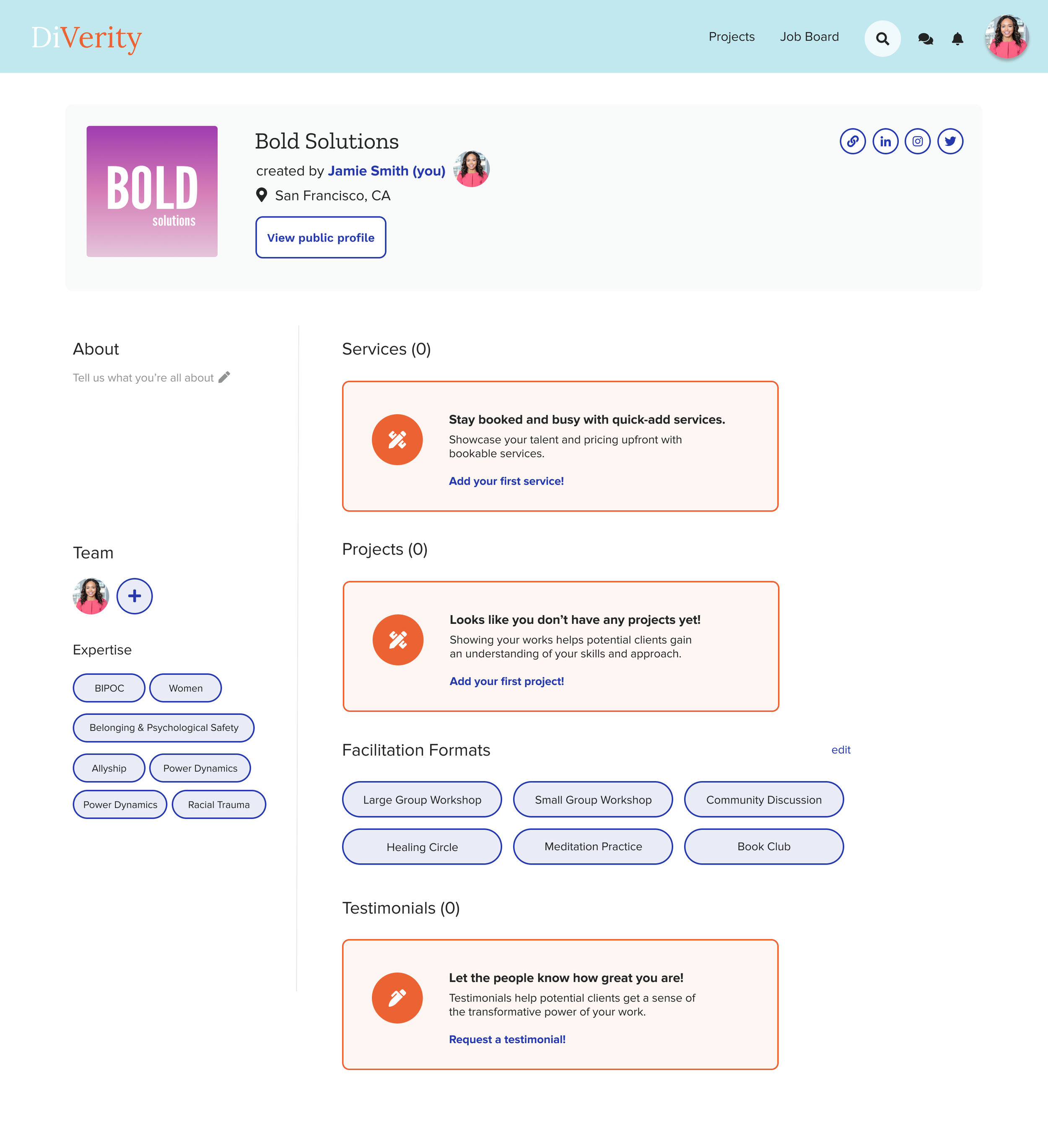
Profile (mostly) empty state with prompts to encourage the consultant to complete their profile by adding their services/projects/testimonials.
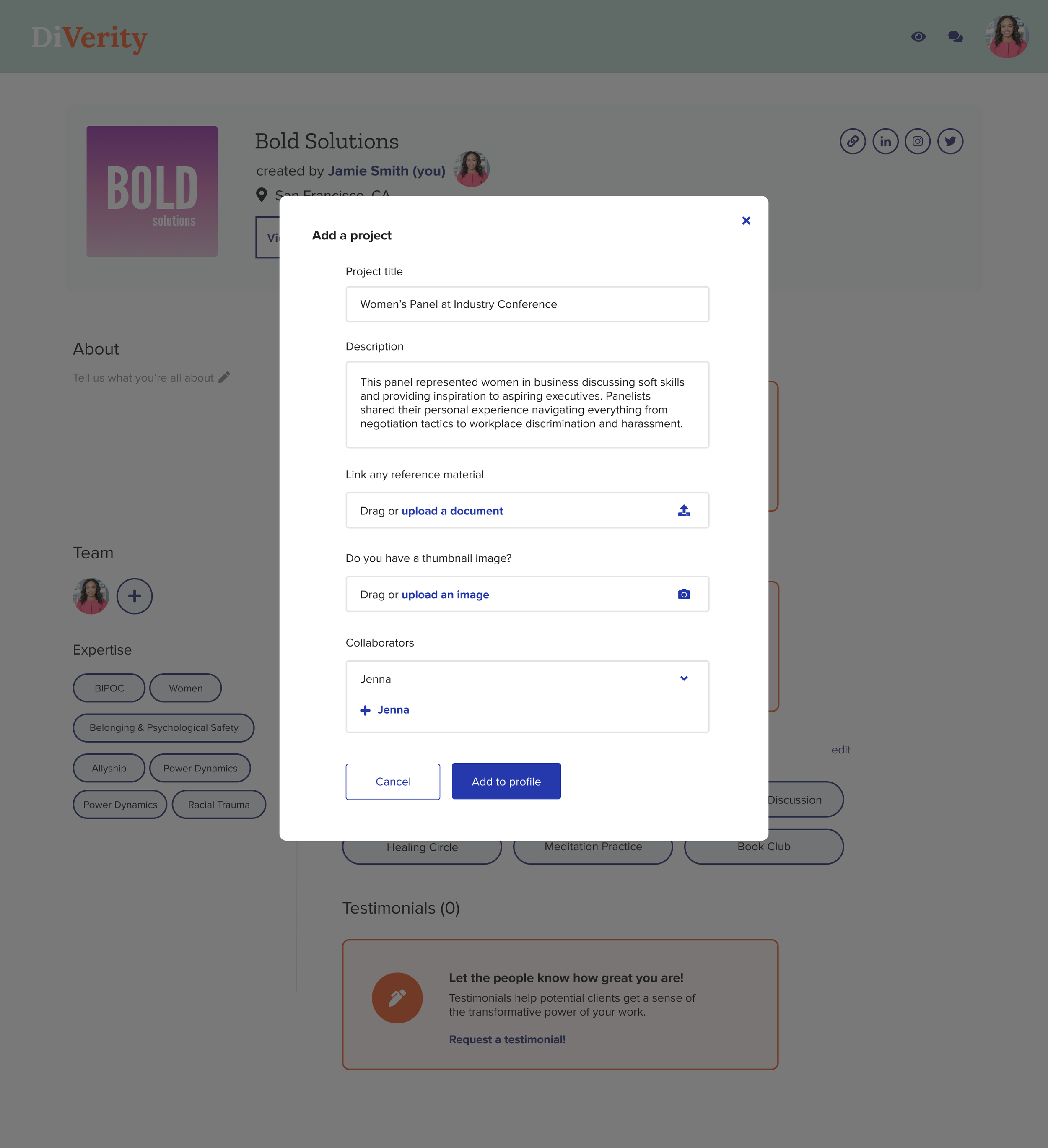
Simple modal experience to streamline the project creation experience on a consultant's profile. I included the ability to add an existing user as a collaborator or "create a collaborator," which would trigger an email for that individual to sign up (and could still show them even if they weren't a Diverity user...yet 😉).
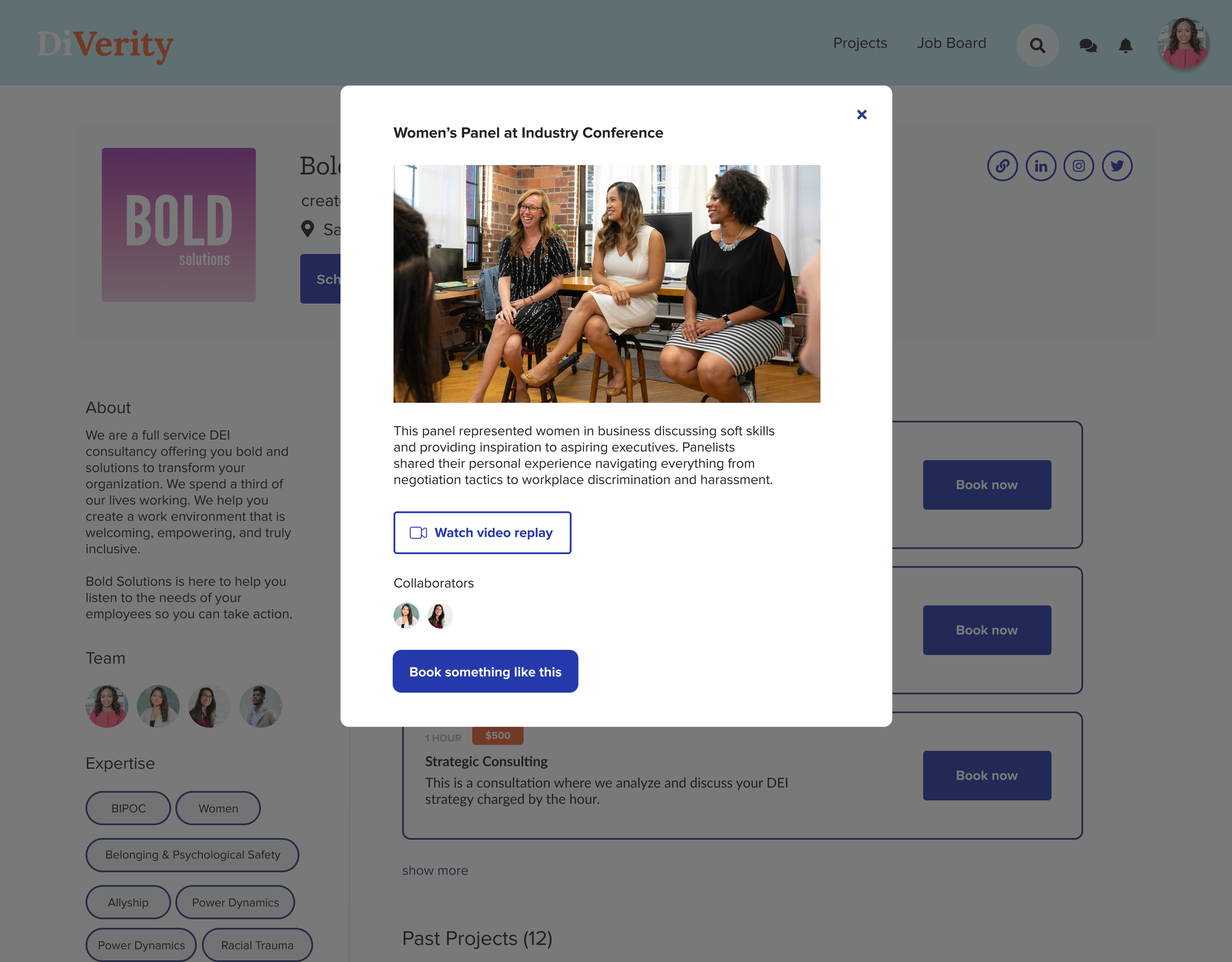
"View a project" launched a modal description of the project with prompts to view more details ("Watch video replay" in this case) and book a similar project. We added this functionality to strengthen the connection between highlighting a consultant's work and driving sales to their business/services. This also helped hiring managers envision the types of engagement opportunities available to their organization. Next steps include tying in topics for increased discoverability.
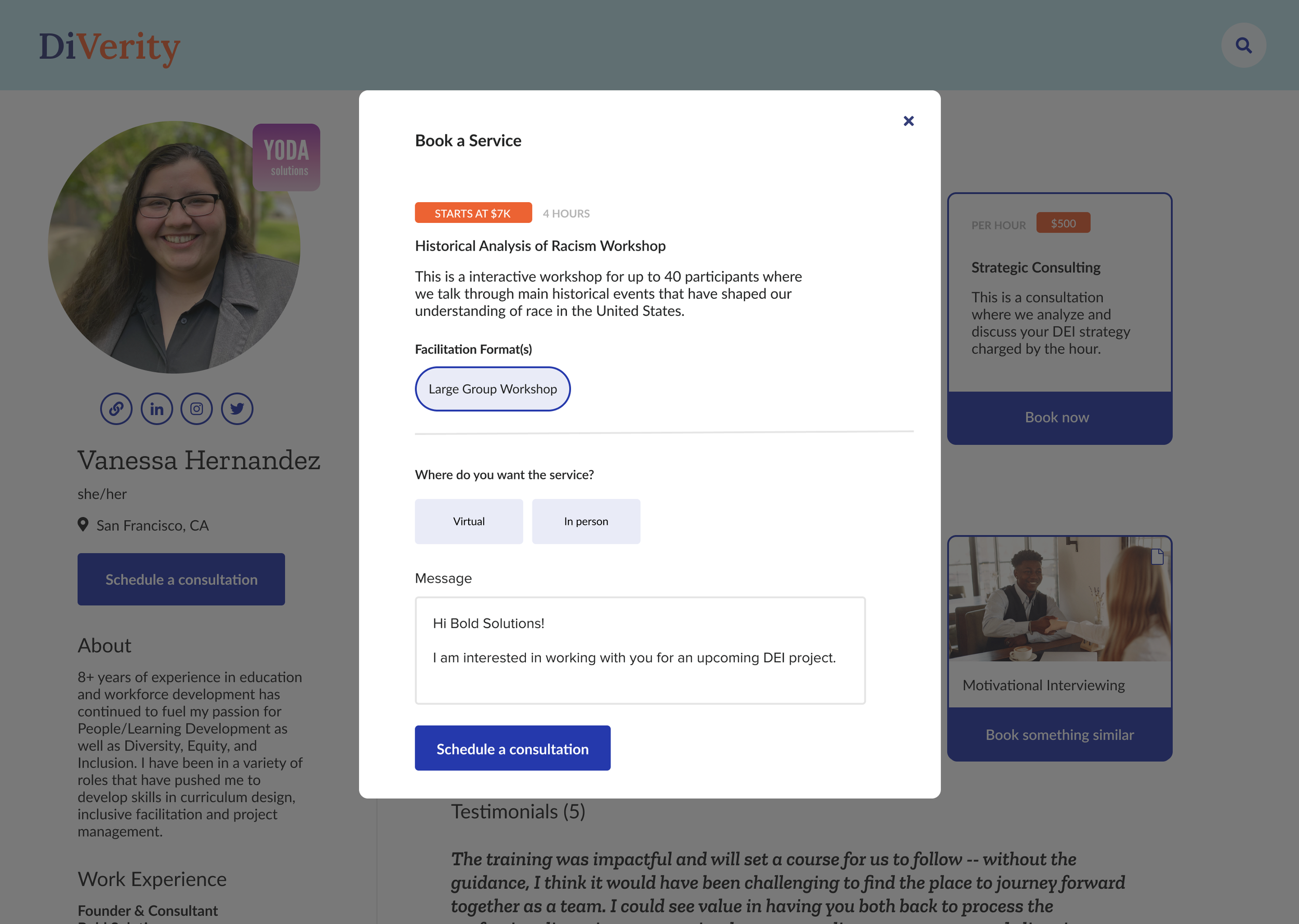
Prospective client view of consultant's profile with ability to schedule a consultation → streamline the booking flow to increase conversion rate for a consultant & improve efficiency for an organization seeking DEI support.
Consultant scheduling: manage your interviews to get hired
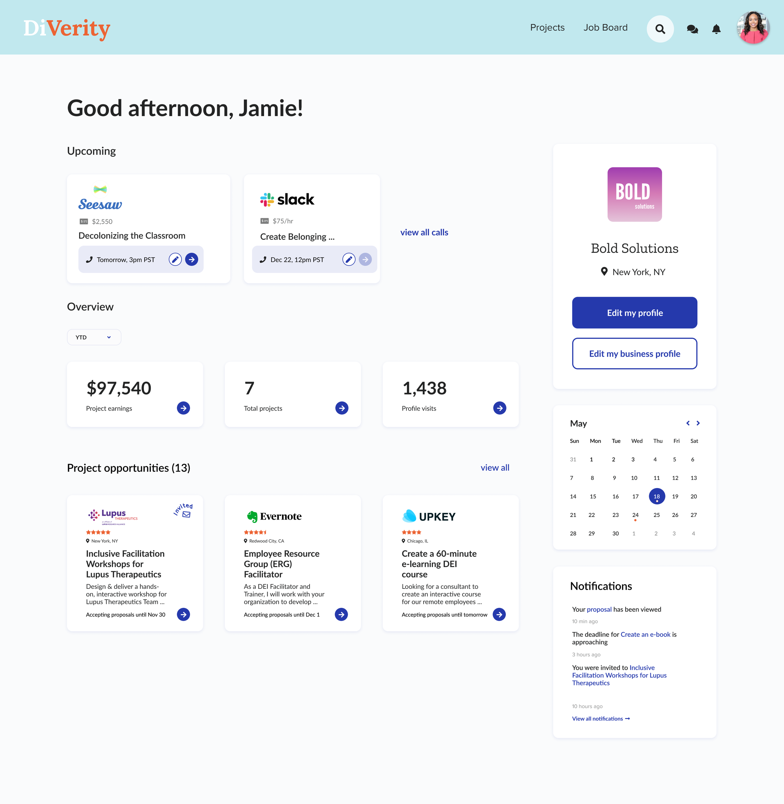
A consultant business owner had a slightly different home view than an individual consultant. We wanted to prioritize upcoming calls at the top followed by an overview of earnings, projects, and profile visits. Project opportunities at the bottom provided a curated list based on the consultant's area(s) of expertise, location, availability, etc.
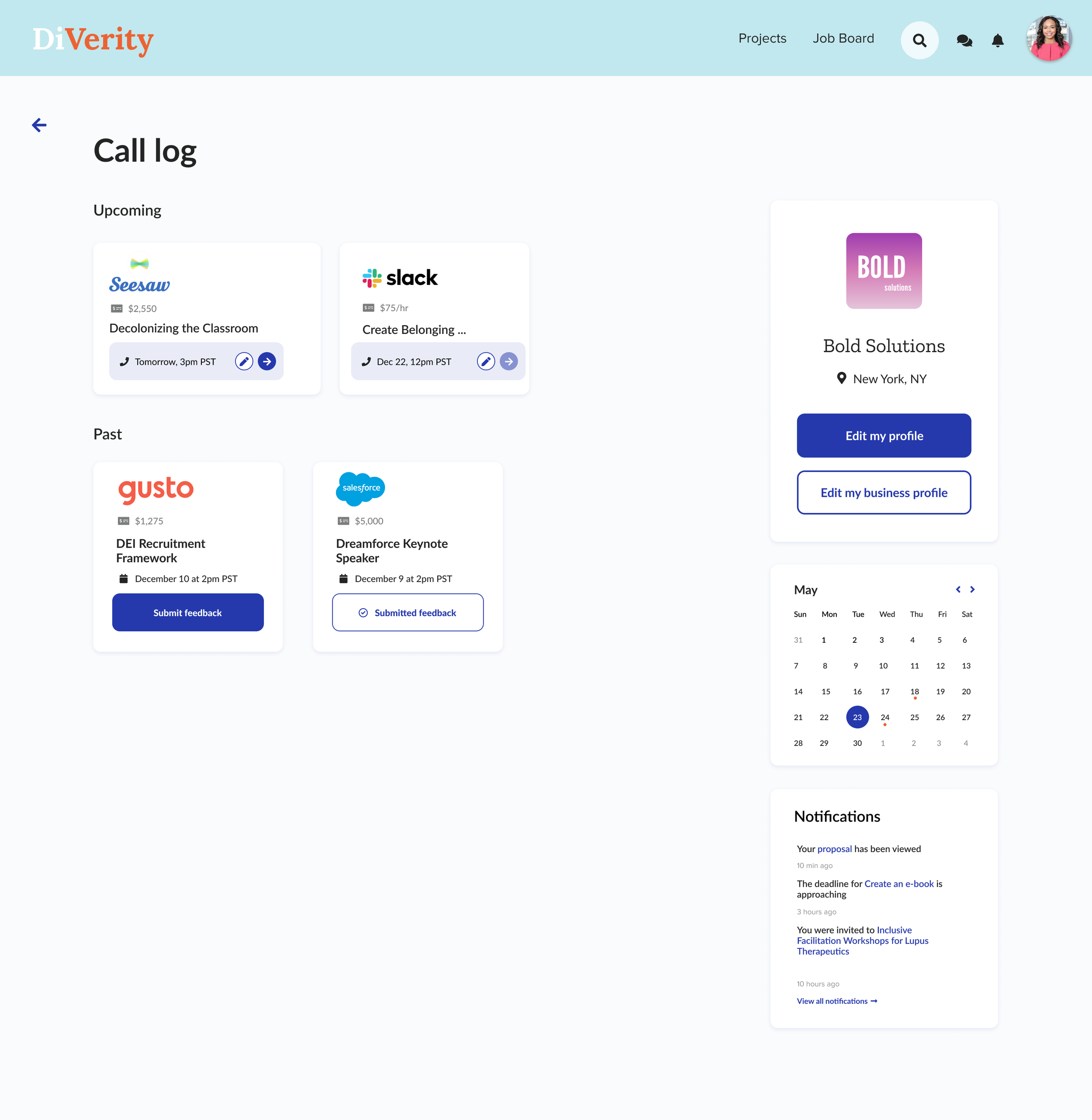
If the consultant drilled into their call log, they could see previous calls and upcoming calls. The available actions and presented data was based on the state of the call.

The feedback was presented in a friendly way to optimize completion rates. This would pop up post call and be presented as an option of the user initially ignored the call to action.
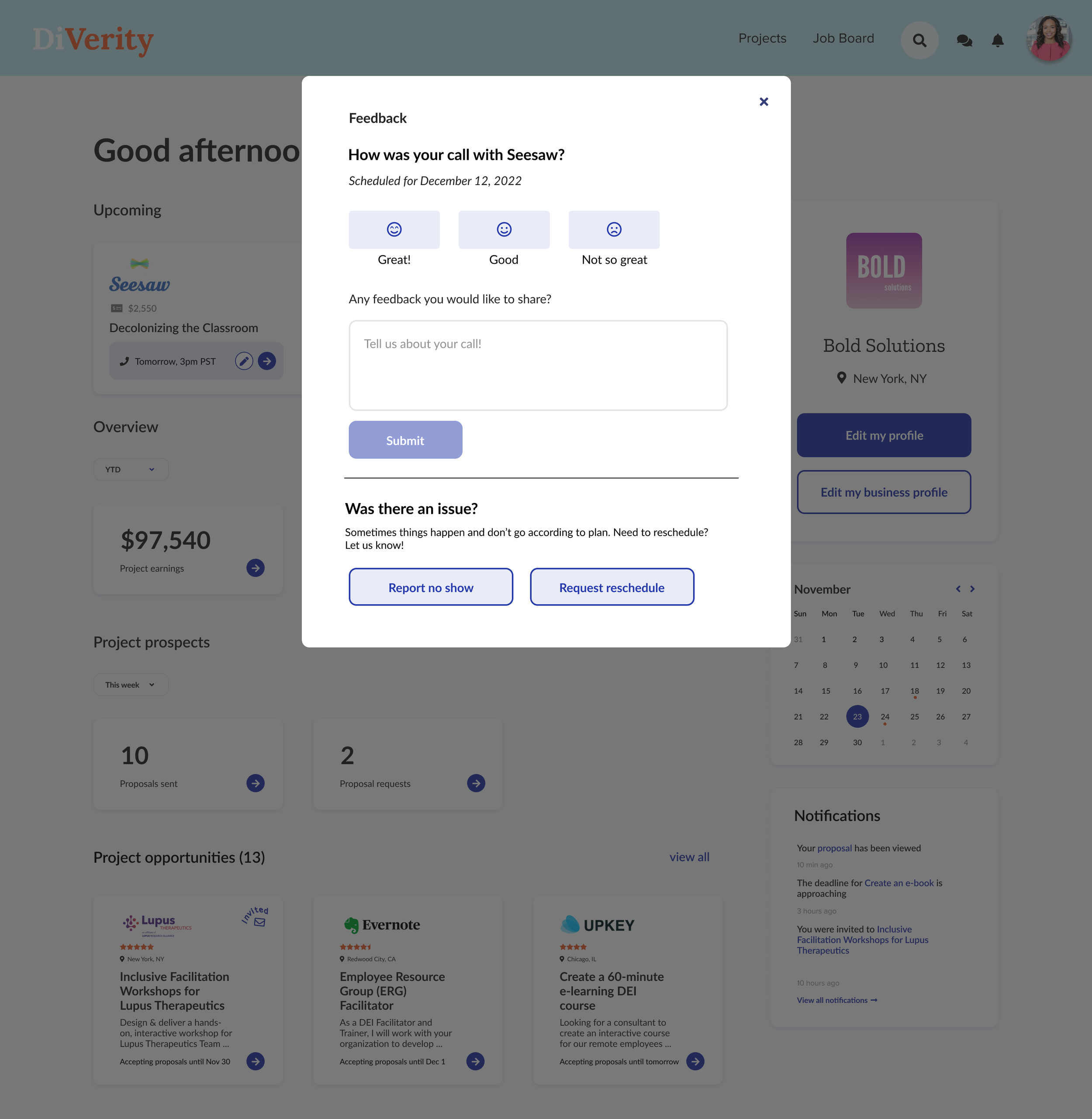
If a user had already completed a call, they were prompted to give feedback. We wanted this to be a simple form that was quick and easy to complete.

The consultant could add details or simply let Diverity know who did not show up (the consultant or the client).
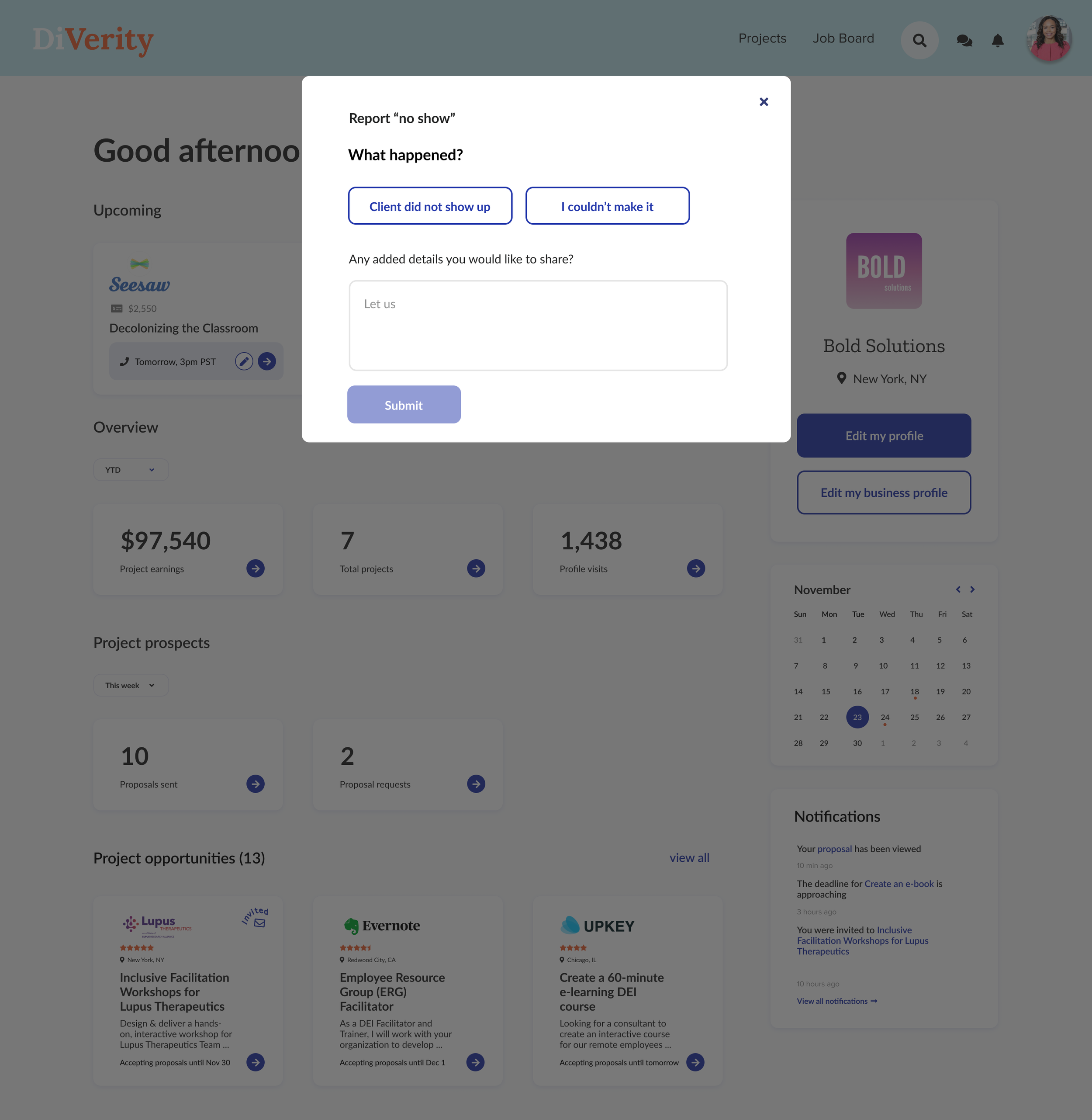
If the client was a no-show, we needed a way for the consultant to let the system know so the organizer could be contacted. This gave the consultant a way to provide feedback on the client to give them more control over the experience and hiring process.

Client's home view. This overview gave the client insight into ongoing projects, spending, upcoming interviews, and a high-level progress report on their DEI initiatives.
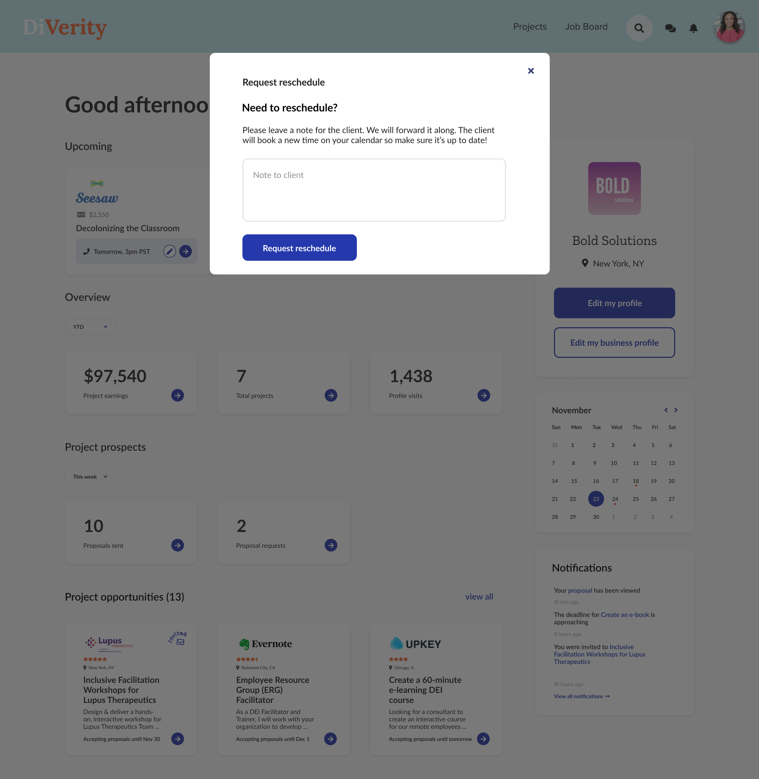
The consultant maintained their calendar in the system, so the client was responsible for booking and rescheduling. The consultant, however, still needed a way to request to reschedule the call without knowing the client's availability. The client would receive a notification with a prompt to reschedule on the consultant's calendar in Diverity.
Improved UI for “How it Works”
a little UI love & user guidance
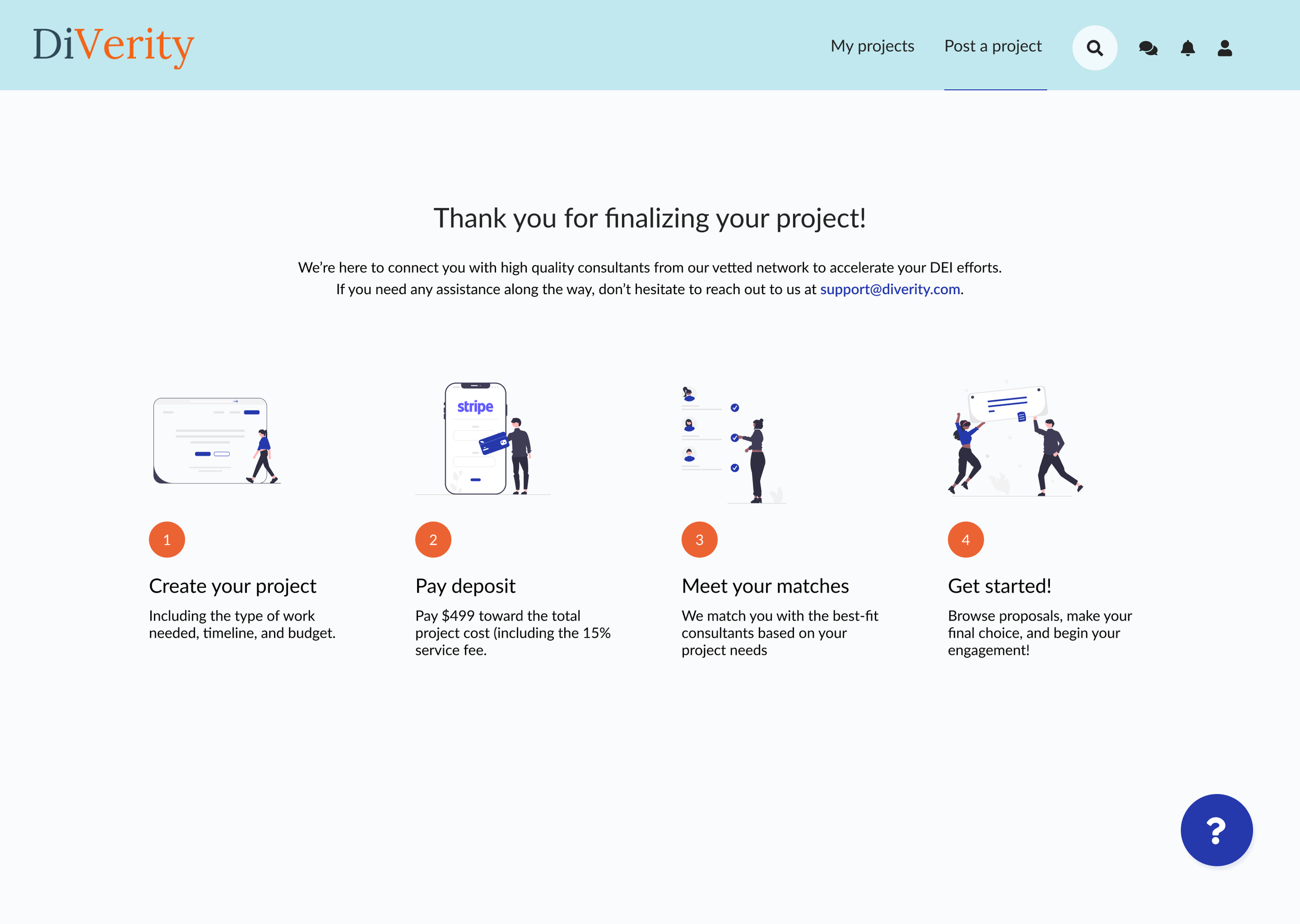
To kick off the matching experience, the Diverity team added a "How it Works" page in the app. This was an important page as it prompts the user to pay and is crucial to generating revenue for the company. This side-by-side shows the original view (on the left) vs. my redesigned instructions page (on the right).
I decided to break the steps down into visuals with fewer words to clearly communicate the process and help the user better understand how the app works and what to expect on the payment front. I used illustrations from unDraw for visual consistency.
From “Matching” to a project creation logic flow
As we started getting clients, we realized the originally designed matching flow wasn't ideal for soliciting work (especially given the chicken/egg challenge of an early-stage marketplace). We decided to introduce a logic flow to create a new project that would match you with a relevant consultant on the backend while giving you the option to post the project publicly for additional submissions.
We started by mapping out the steps in Figma with the original screens from the project <> consultant Matching Flow.
Each choice determines the following set of questions/options to guide the (company/client) user through their journey.
Subcategories allow for backend tagging and optimized matching.
We leveraged breadcrumbs to allow the user to make a selection and continue browsing through their options.
Submit a proposal
consultant & client UX
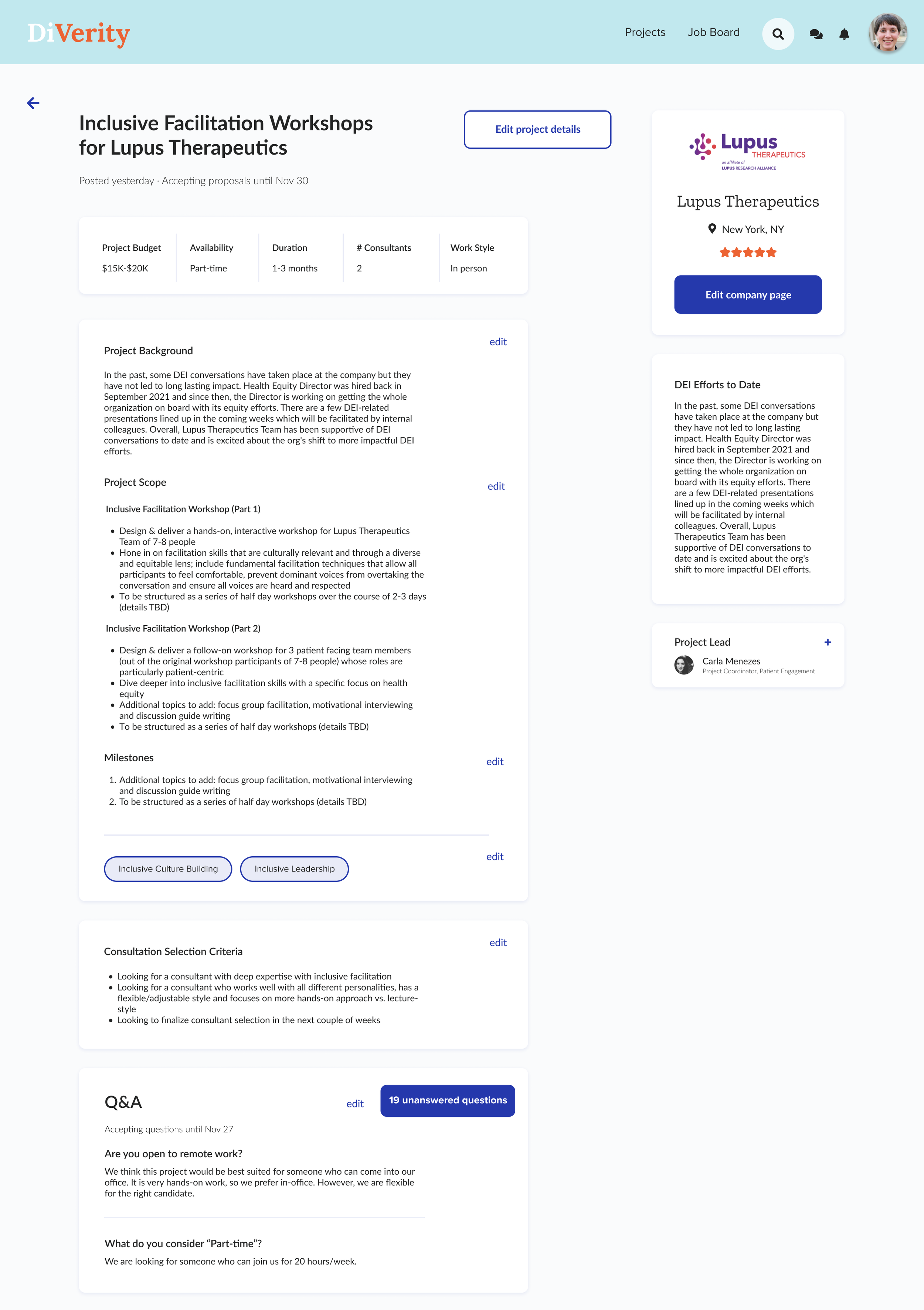
After completing the "Create a project flow," the client can edit project details.
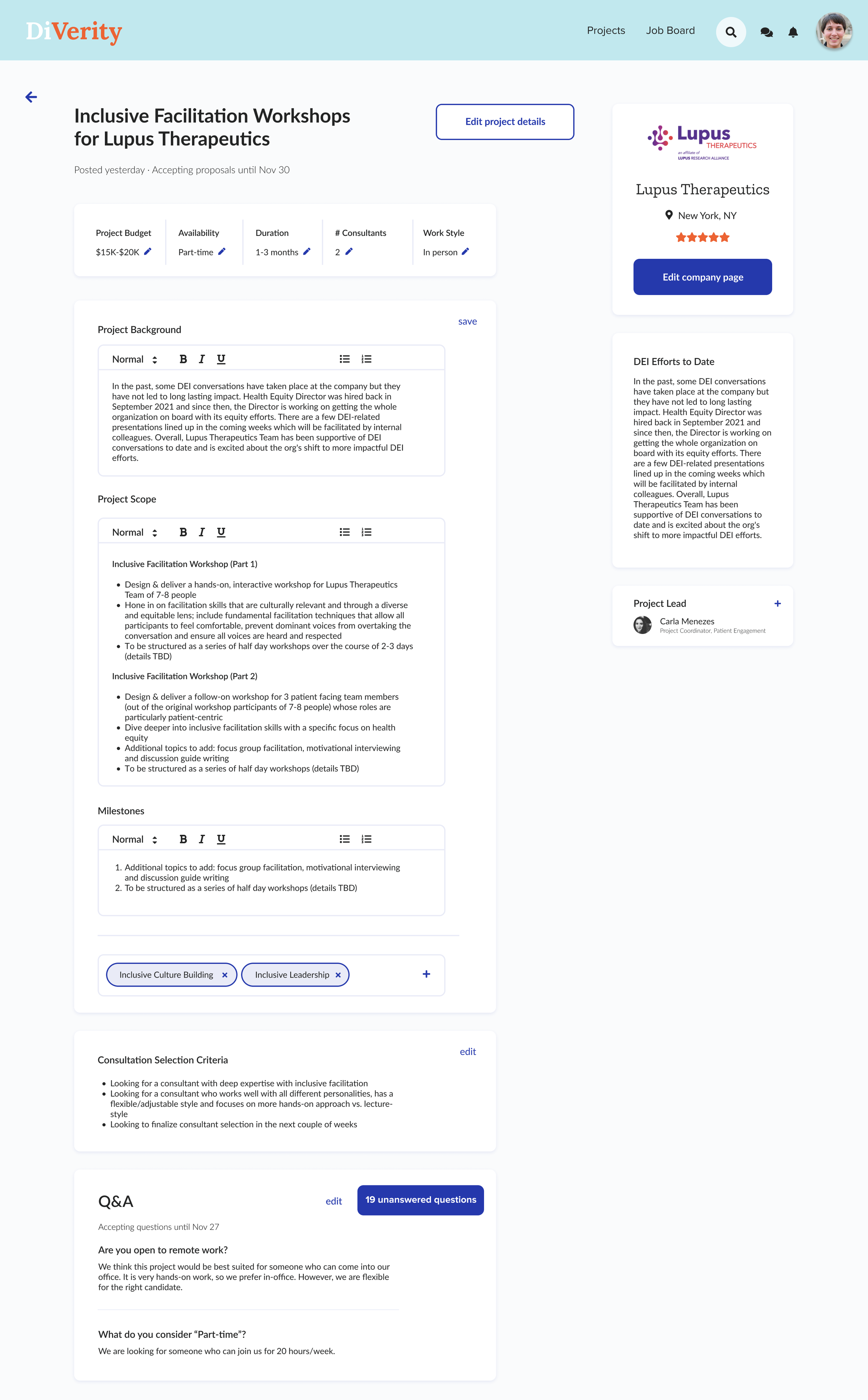
Clicking "edit project details" would expand the fields and allow the user to edit the different sections.
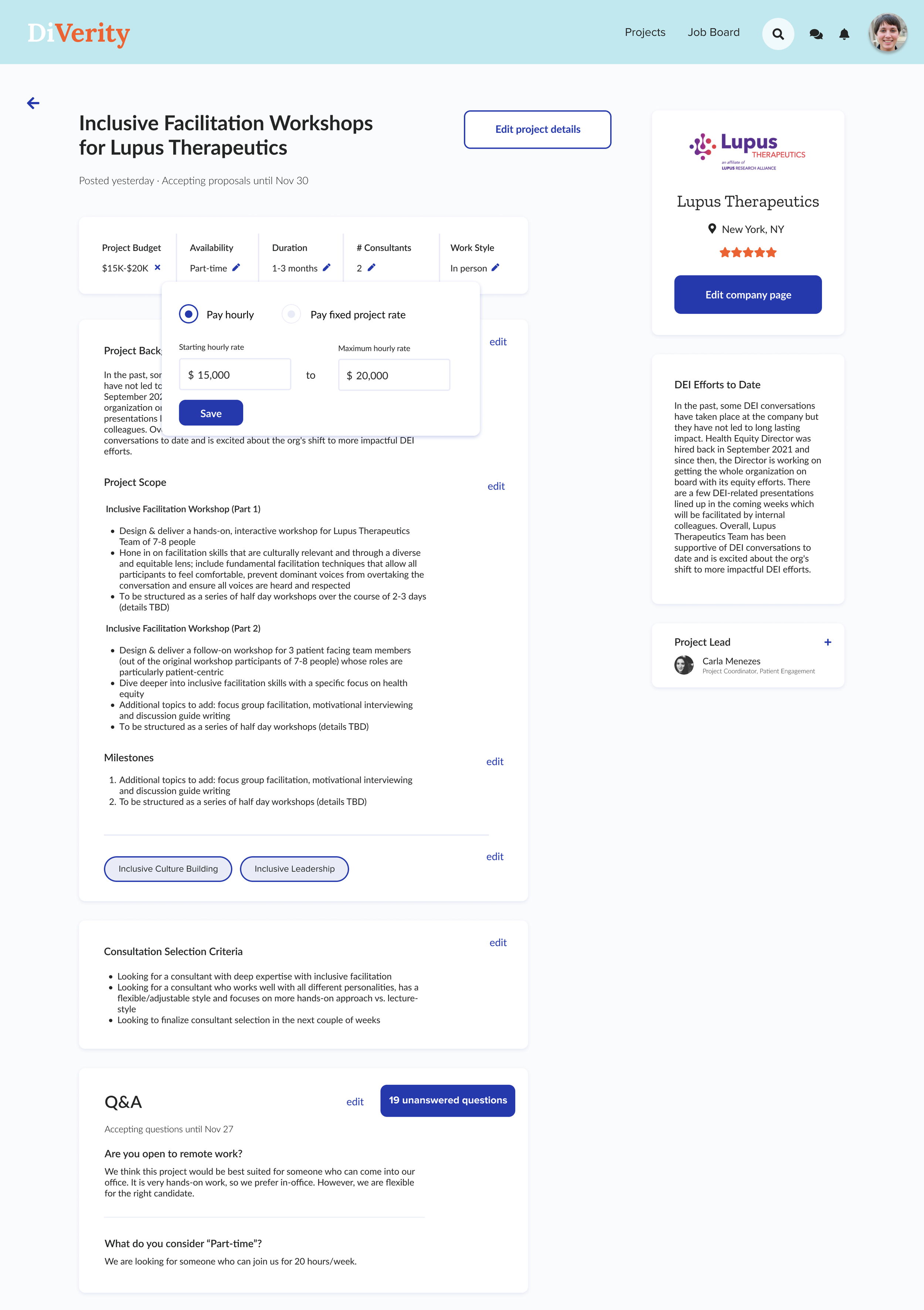
Client could quickly edit overarching project details at the top.
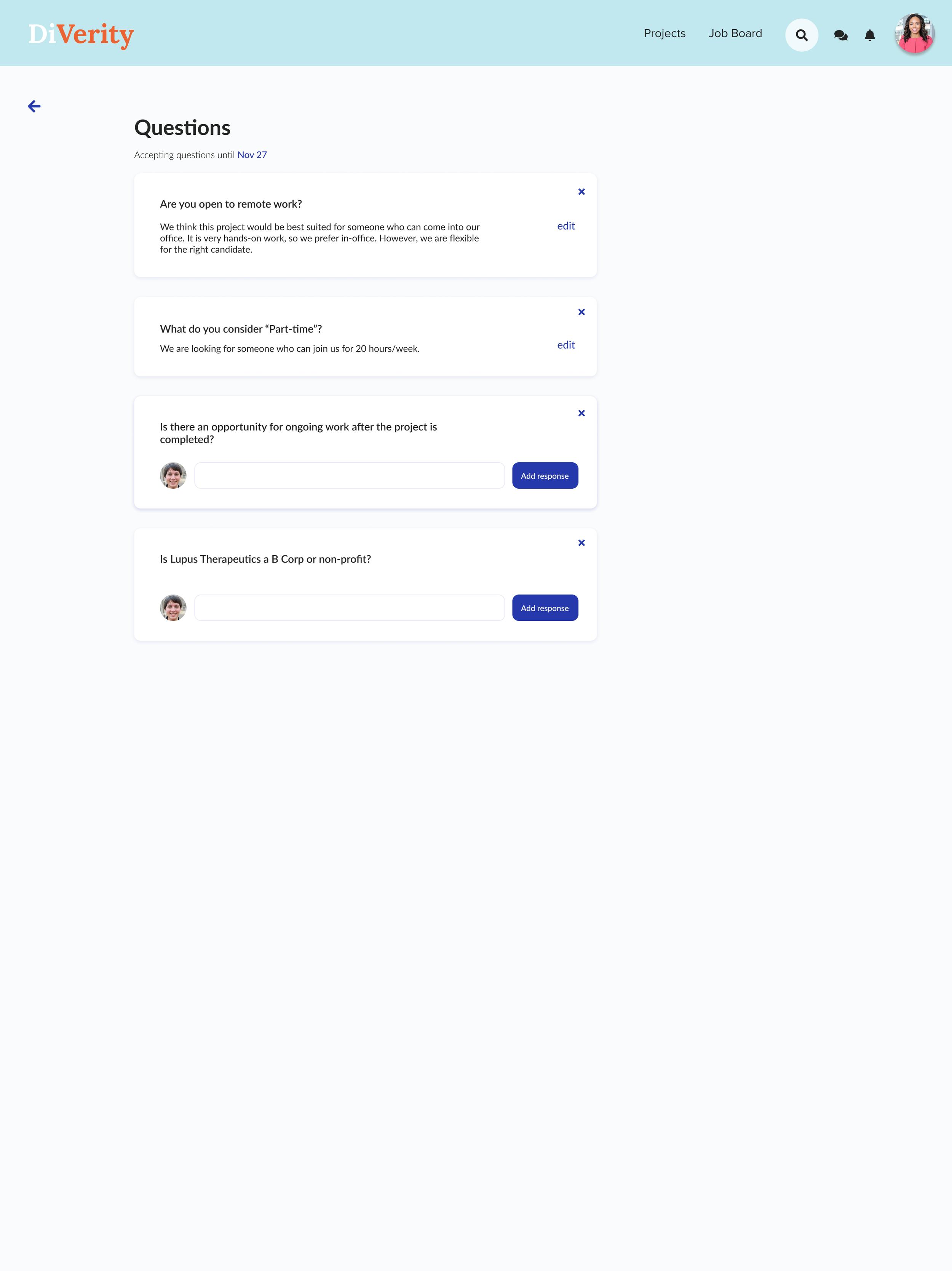
If consultants had asked questions, the client could drill in further to respond.
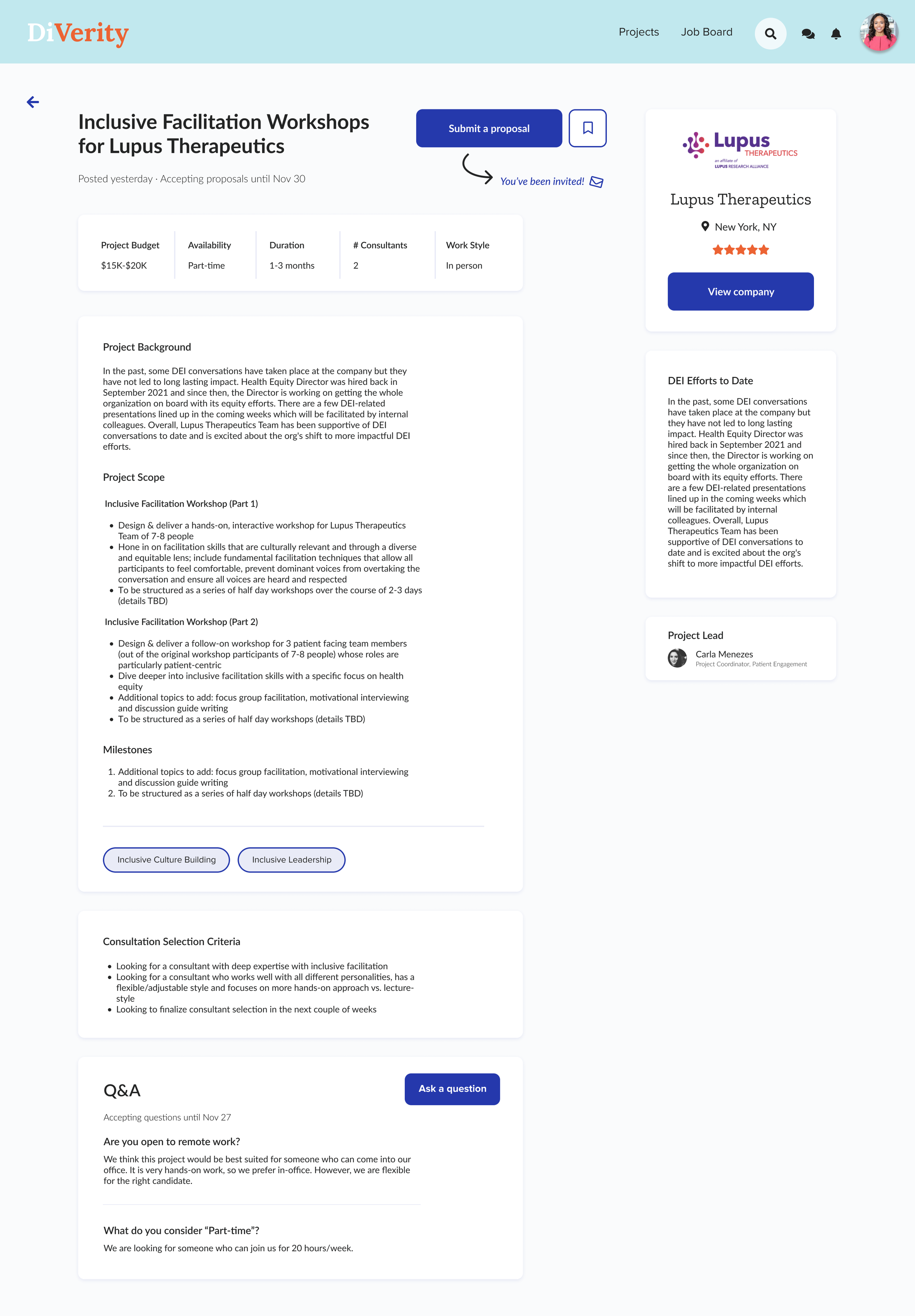
This view allowed the consultant to apply to a project or ask clarifying questions. The side panel provided more details about the client and their DEI efforts to date.
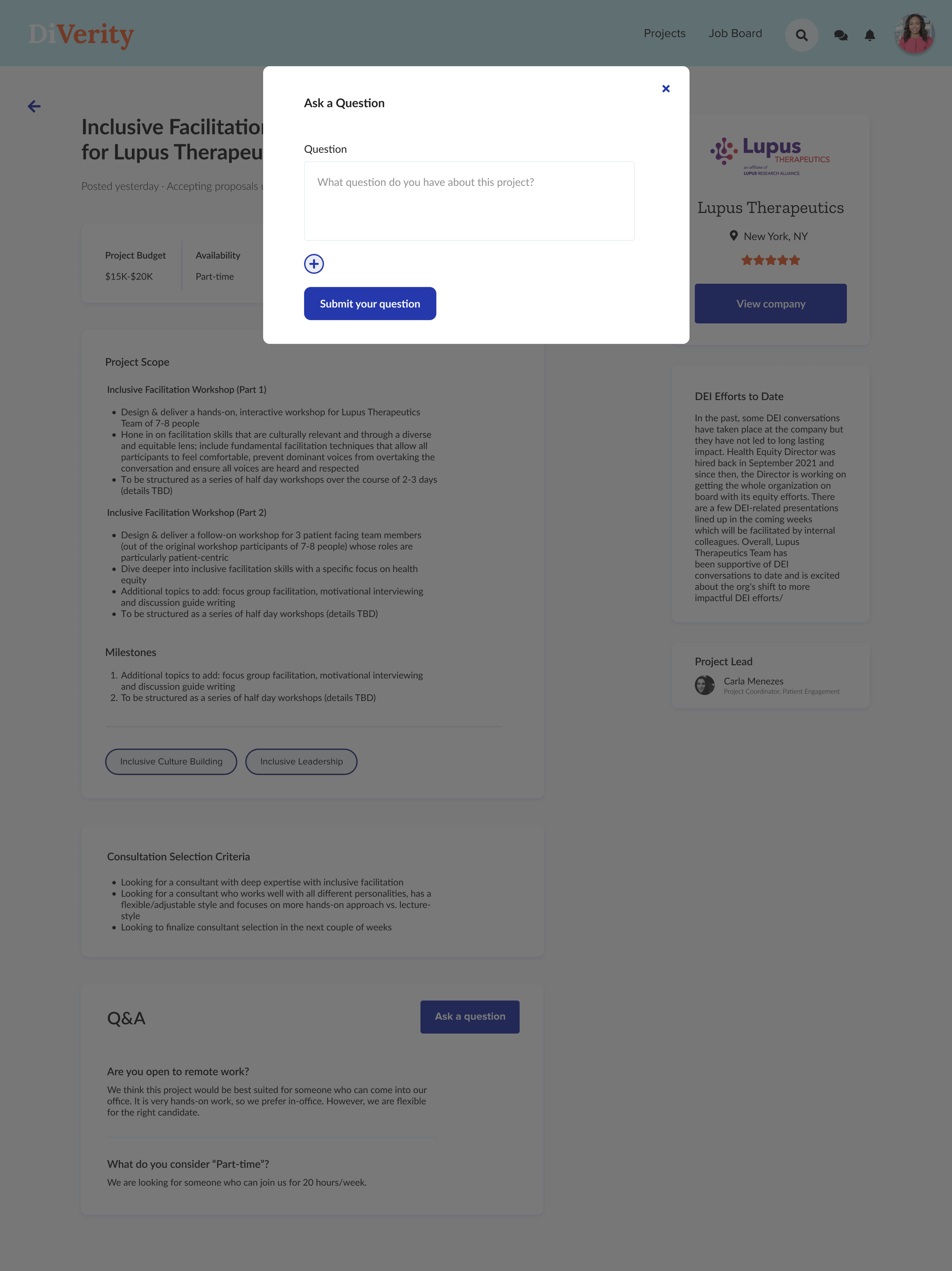
Similar to an Amazon product page, we added the ability for a consultant to ask clarifying questions prior to the proposal deadline.
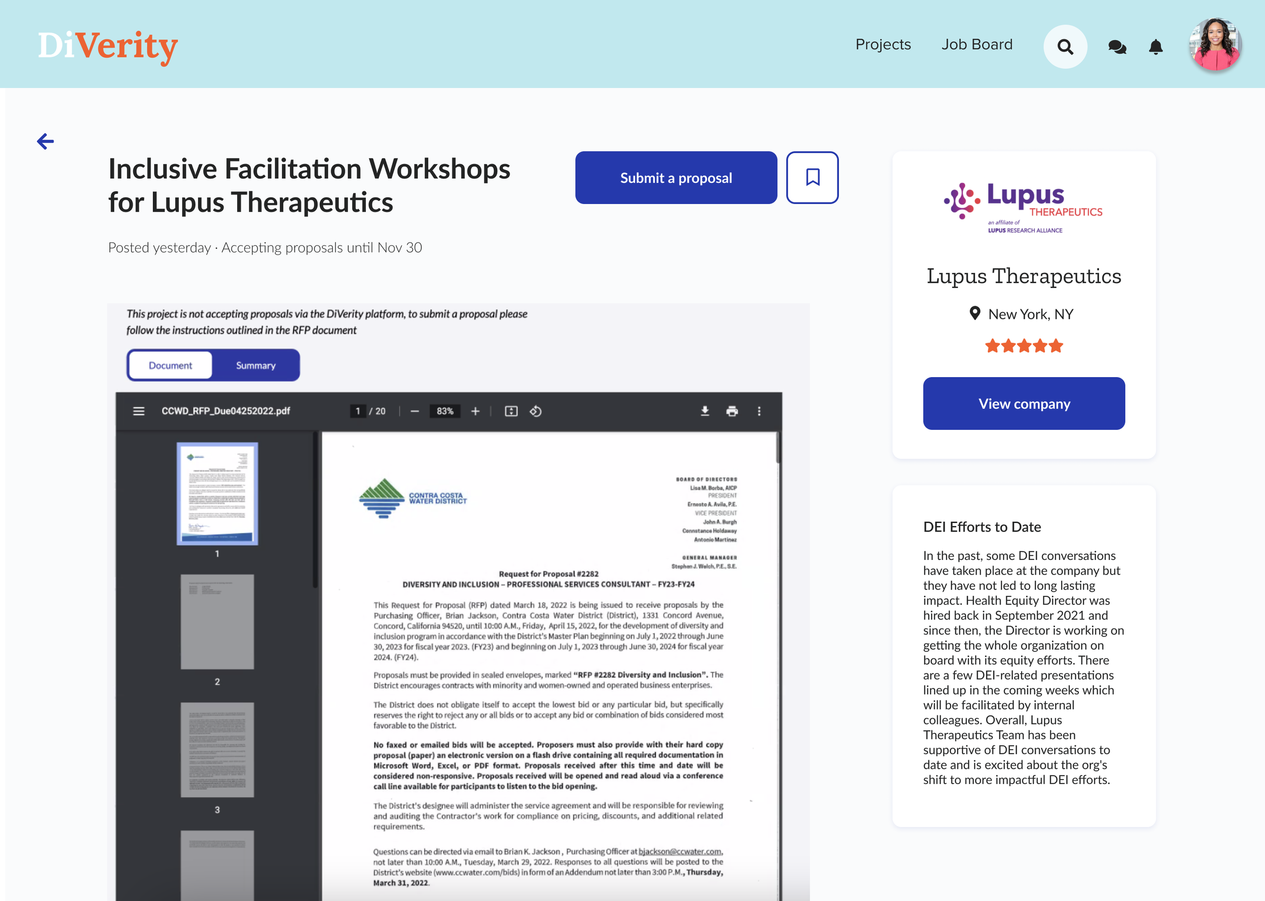
Currently, many companies use their own RFP - a multi-page PDF doc with instructions on how to apply. The goal of the platform was to standardize this experience for both clients and consultants. However, we needed an interim solution for clients that already had an RFP but still wanted to use Diverity. To facilitate this, I designed an experience to import the PDF and allow the consultant to apply externally.
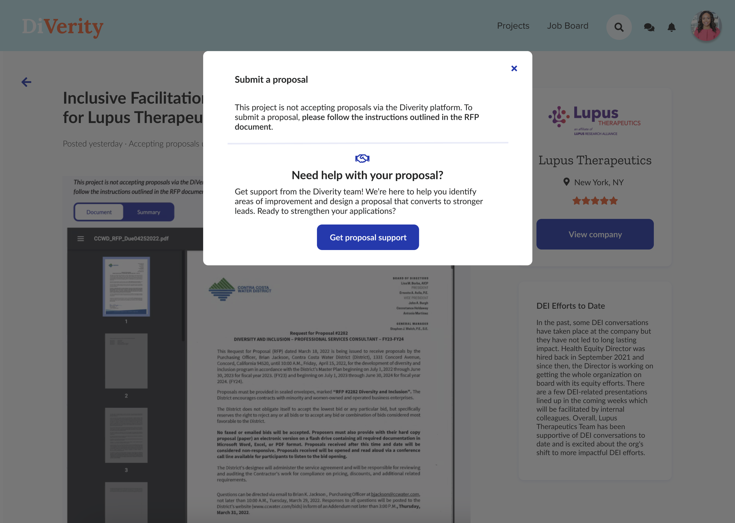
To still demonstrate the value of the platform, we provided instructions for consultants applying to an external application.
Outcome & Takeaways
Outcomes
New 'create project' flow (vs. initial matching experience) increased client project creation rates
Novel RFP upload gave Diverity a new acquisition strategy and improved UX for companies not yet ready to embrace entirely new framework for receiving proposals
Diverity landed first paying client in 2022
50+ consultants on the platform, onboarding ~9 weekly
"So far, very positive feedback"
Takeaways & Next Steps
Patience and prioritization are key with limited resources
User priorities may conflict (in this case, clients vs. consultants) → bring it back to the problem
Next steps would be to test the platform with clients and a formal user test for consultants. I would also like to revisit the overall UI (color palette, font choice, etc.) and expand on the client experience.


