Modern Language Exchange App
Match with fellow language learners in your city. Dialogue half in your native language and half in theirs!
Context
Lexody's CEO approached me to redesign their mobile app. Lexody allows users to practice speaking any language with a native speaker, face to face, in their city.
Goals
Leverage onboarding as an opportunity to educate users about the app and what they can get out of it
Challenge & insight: because it's a language exchange app, not all users speak English
Introduce gamification
Prompt users to take action
Enhance visual design
Onboarding ⟢
Onboarding ⟢
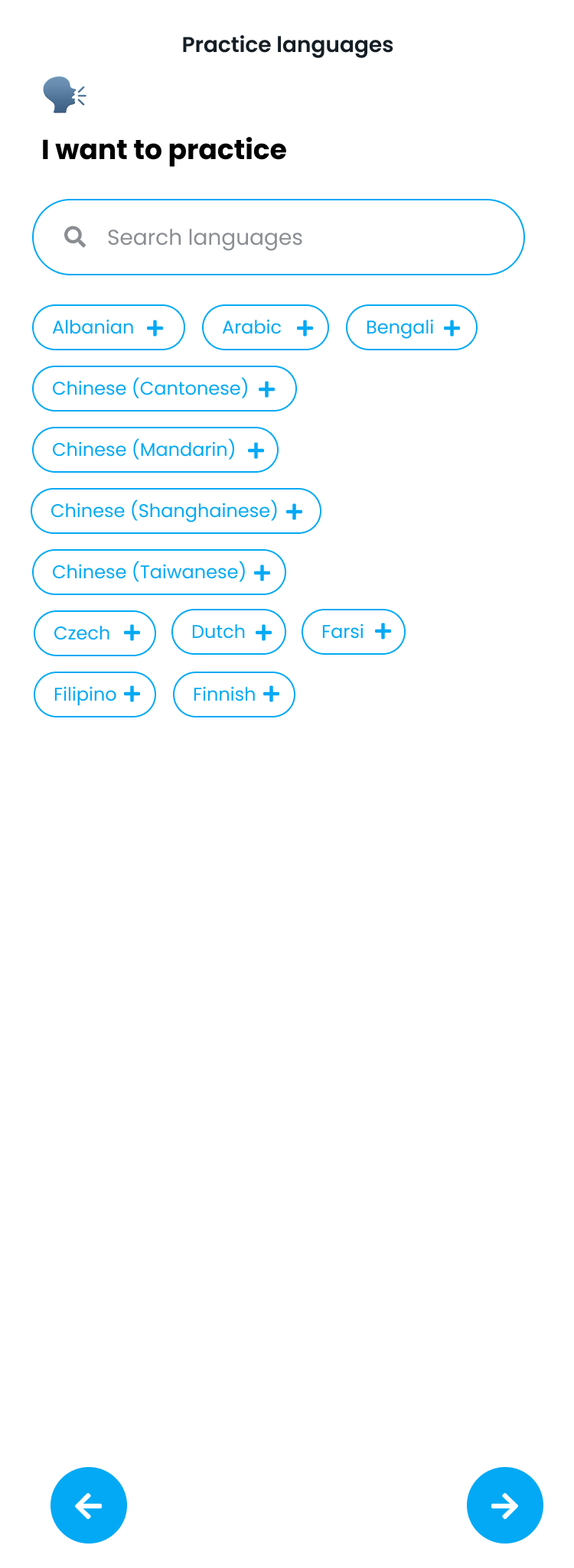
In order to make onboarding more intuitive to non-native English speakers, I added emojis and made sure labels were clear and concise.
Given that a user could be exploring/learning multiple languages, I explored different ways for them to select what language they want to practice. I didn’t want the experience to feel cluttered, but wanted to show them all of their options (also for inspo!).
By contrast, we leveraged the native (iOS/Android) picker as a standard dropdown to select the user’s native language. Given that a user could speak multiple languages fluently, there is room here to expand upon this selection.
On the final screen of onboarding, I added an illustration of coins and a welcome message to let users know about Lexicoins and how they can be used in the app.
This decision was made in response to user confusion on the use of Lexicoins vs. “Connect coins.” We decided to consolidate the coin type for simplification, especially for non-native English speakers.
Buttons prompt the user to get started by meeting matches or to finish their profile, encouraging more interaction in the app and guiding them where to go.
Redesigned Home ⟢
Redesigned Home ⟢
The goal was to redesign the home page to be more inviting and actionable.
Opportunities
Make home page more actionable (let the user know their options and what they can do, also provide guidance on what they should do)
Boost in-app activity through conversations, matching, scheduling Lexes, and practicing for a Lex
Update the UI to make it feel more modern, clean, and engaging
Original home design

This exploration for home highlighted your matches at the top and upcoming Lexes - to drive you toward making conversation & scheduling/going on a Lex. I explored the use of cards to let the user know other ways they could engage with the app.

This second mockup used a different illustration pack for a more playful look and feel. I also added sections for "Recommended reads," which would be based on the language a user was learning and their level. Local Lex spots invited more in-app discoverability and also presented a business opportunity to partner with local restaurants/coffee shops/co-working spaces for lexes. Room to expand here for community-sourced reviews and ratings.

This third exploration brought (what I coined) "Lextivities" front and center to encourage users to play language-learning games in the app. This provided more value as a way for users to prepare for a lex and use the app even when they weren't lexing.
Lexody's CEO wanted the app to look more modern and engaging. To accomplish this, I updated the font and used bright colors, while leveraging white space to keep the overall aesthetic clean and de-cluttered.

Explorations ⟢
Explorations ⟢
Below are a series of explorations for settings in Lexody. Similar to onboarding, I leveraged emojis for familiarity (especially for non-native English speakers, given that the app is currently written solely in English).
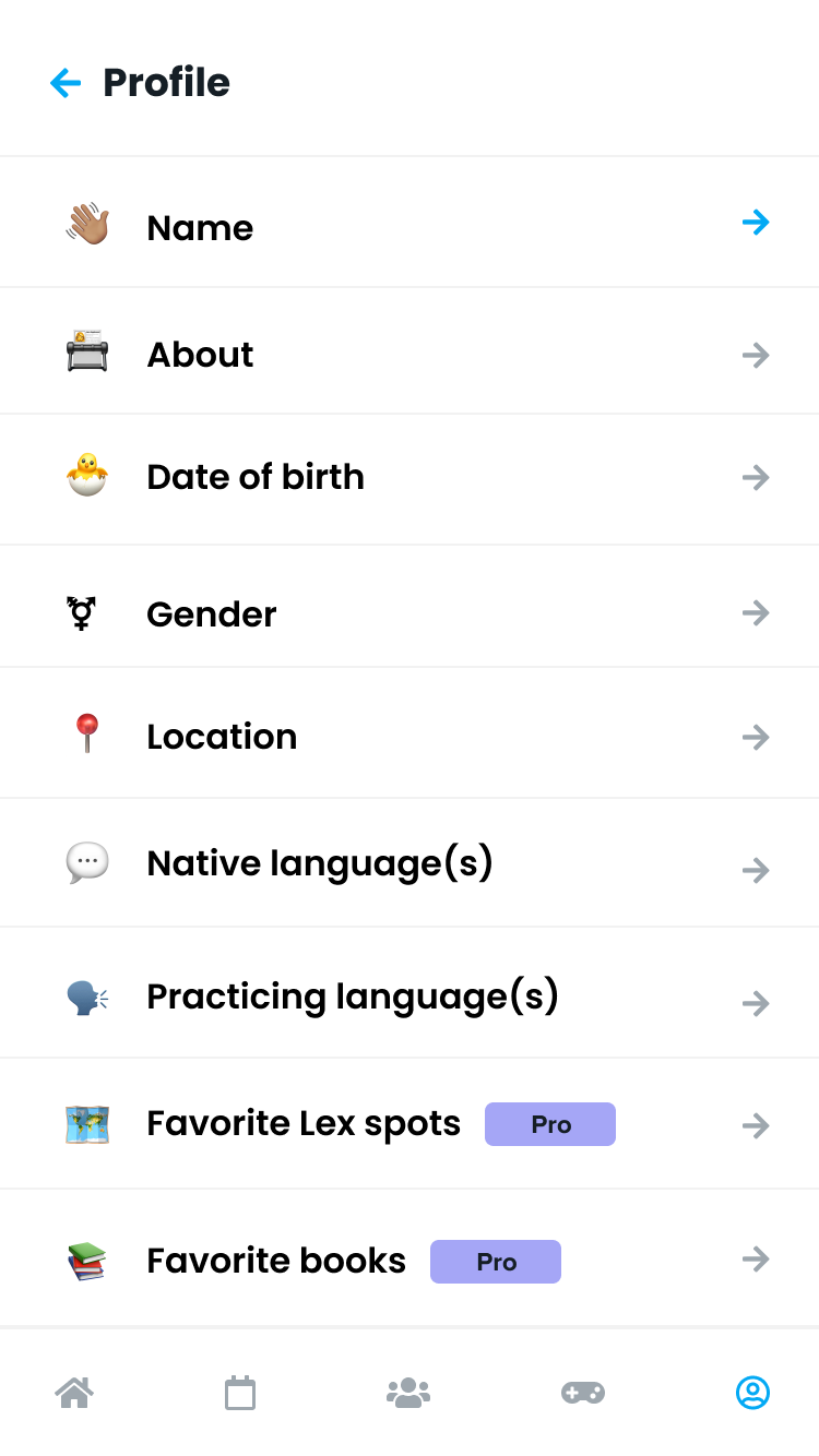
Leveraging the emojis from the onboarding experience, I broke down settings by category so the user could update their initial responses.
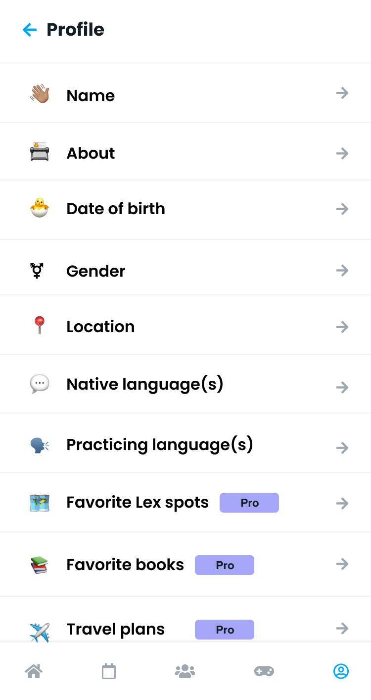
This scroll view hints at a future feature that would allow users to add their travel plans. This would help Lexody grow internationally and provide more value in the app for eager language learners (thereby also encouraging them to upgrade for expanded features).
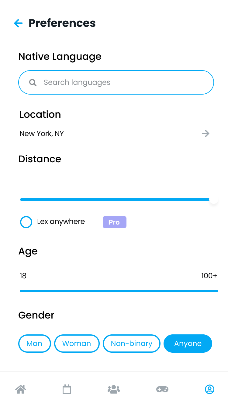
This updated preferences page matched the UI changes I made overall for a cleaner, more simplified aesthetic.
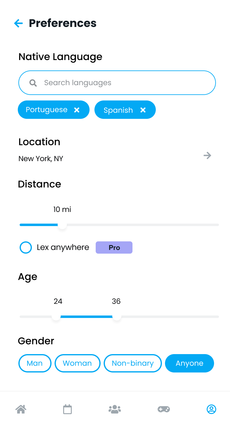
This mockup showed how the page would change after interactions such as adjusting your preferences or adding multiple native languages.
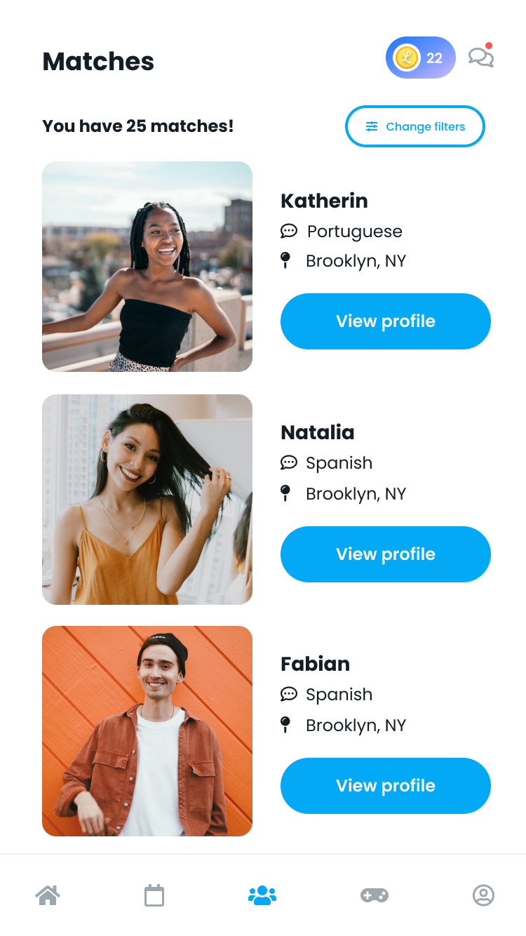
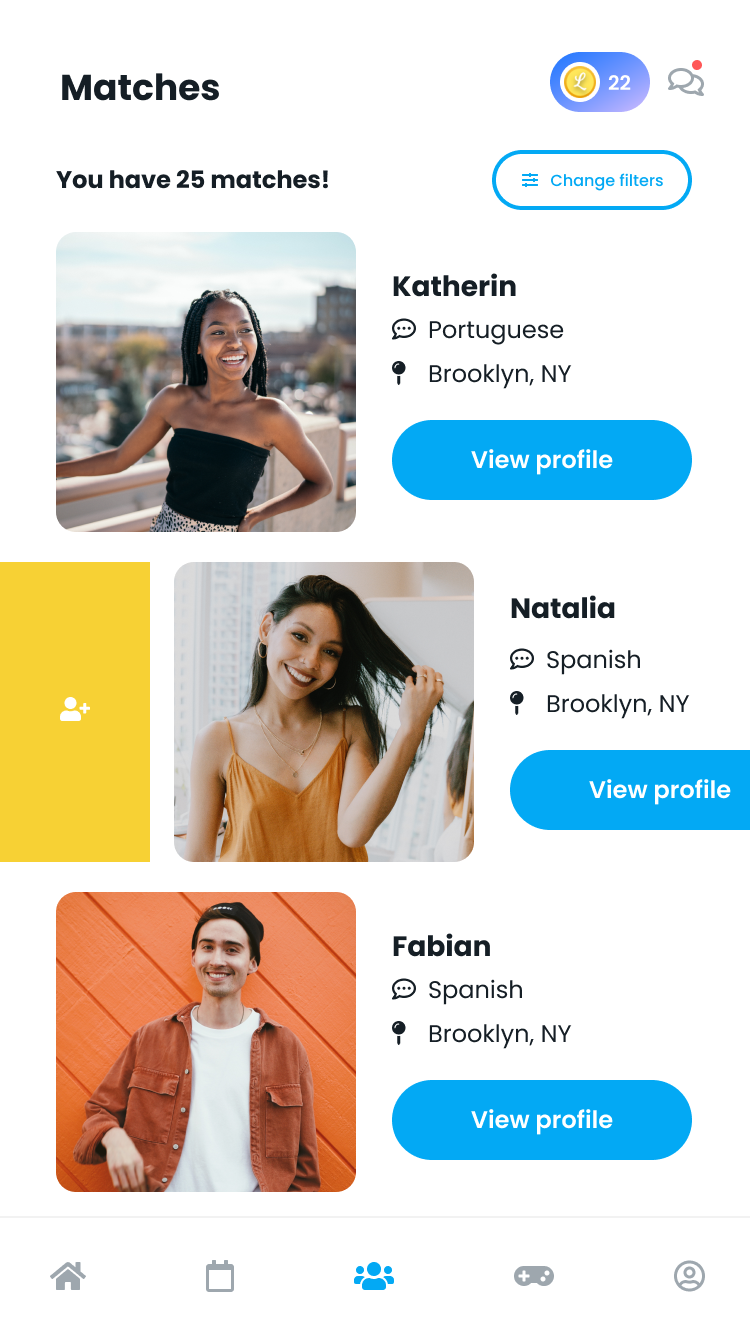
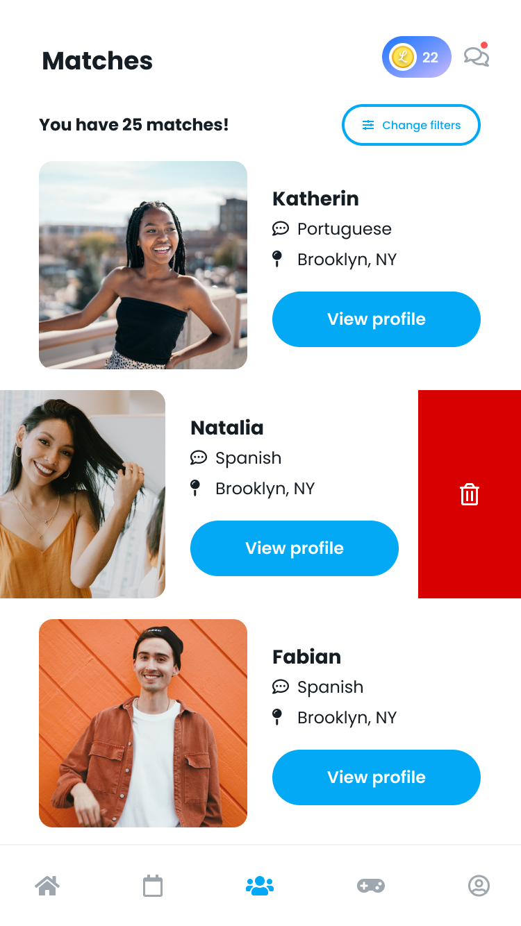
I also explored the chat/connections experience to encourage more people to start a conversation and book a Lex.

Inspired by Bumble, I put requests at the top with an expiration timer indication to encourage the user to connect before time runs out. I also wanted to give users the option to search and filter through their chat messages.
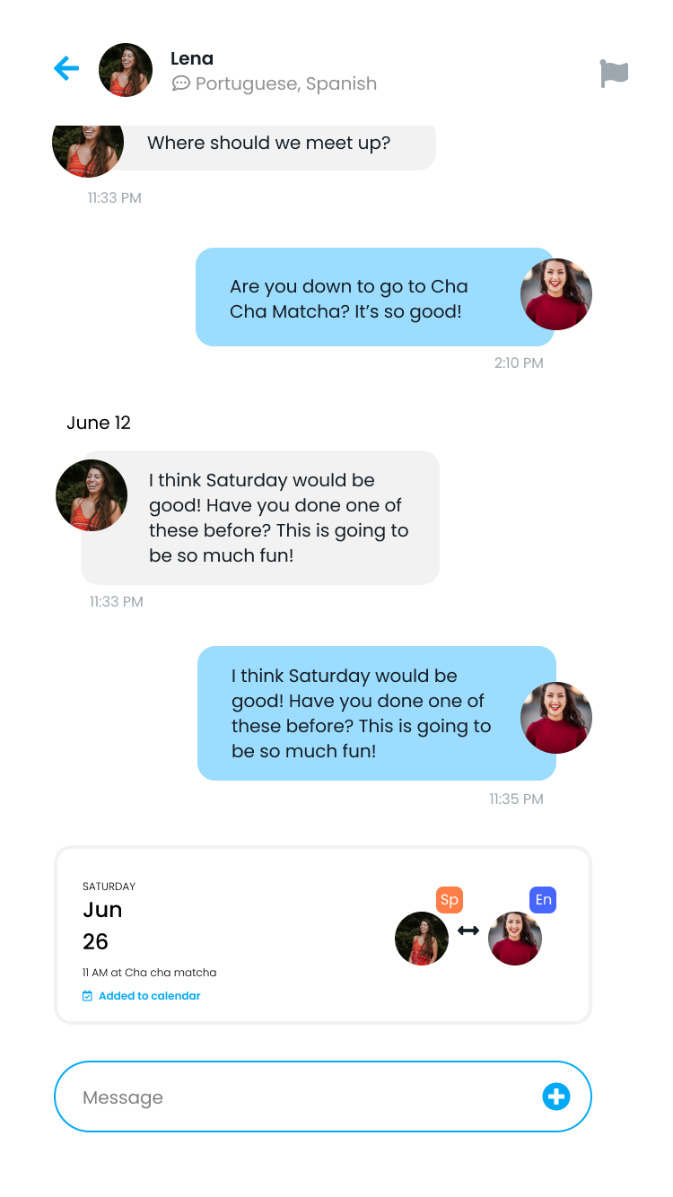
The primary goal is to actually schedule a Lex. I added an option to show the upcoming Lex with details about the location and time. I also added little icons to show which language each person spoke natively/fluently.
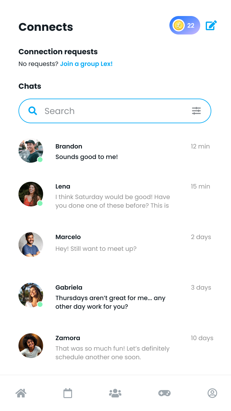
If a user didn't have any new connections, I added a prompt to join a group so they could still engage in the app and practice their language skills.

This is the entirely empty state for chats/connects. What if you have no one to talk to. The primary call to action here is to find a Lex partner, which would take you through a matching quiz or prompt you to add more details to your profile for a more accurate match.
Feedback ⟢
Feedback ⟢
“
"I am obsessed with the designs and it made me realize I need a full-time designer"
~ CEO & Founder of Lexody
”
Outcome ⟢
Next Steps ⟢
Outcome ⟢ Next Steps ⟢
Outcome
CEO (also lead and sole engineer) built out designs and is currently implementing UI changes
Pricing page improvements (not depicted) increased subscriptions/in-app purchases by over 200%
Next steps
Design in-app games for users to play during and before Lexes
Work with language expert to design in-app exercises and feedback loops to enhance user learning and retention


